

記事内に商品プロモーションが含まれる場合があります
今回はWebサイトやブログで表を作る方法を解説します。1つずつ丁寧に解説していくので、HTML/CSS初心者の方もご安心ください。
1. HTMLのtableの使い方
<table>はHTMLのタグの1つです。<tr>や<th>、<td>などのタグと合わせて使うことで表を作ります。タグの名前が似ていて分かりづらいんですよね…。
1-1. それぞれのタグの意味
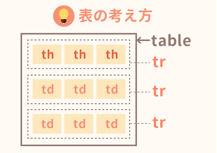
それぞれのタグをどこで使うのか図にしてみました。全体はtableで囲み、行のカタマリはtrで、見出しセルはth、データのセルはtdではさみます。
もう少し詳しくまとめてみます。
各タグの略称と解説
- table:表全体をはさむ。
<table>〜</table>の範囲が表となる。 - tr:Table Rowの略。行全体をはさむ。いくつ使ってもOK。
- th:Table Headerの略。trの中で使う。はさまれた部分は見出しセルとなる。列見出しにも行見出しにも使える。
- td:Table Dataの略。trの中で使う。はさまれた部分が表の中身のセルとなる。いくつ使ってもOK。
このようにセルを結合しない表では「trの数=表の行数」、「1つのtr内のtdやthの数=列数」となります。セルを結合する場合は、他の行から伸びるセルや複数列を占めるセルも含めて数えます。名前が似ているので混乱してきますね…。
1-2. 書き方
実際に例を見てみるのが分かりやすいかもしれません。試しに簡単な表を作ってみます。
<div class="table-scroll" role="region" aria-label="果物の表。必要に応じて横にスクロールできます" tabindex="0">
  <table class="fruit-table">
    <caption>果物と味</caption>
    <thead>
      <tr>
        <th scope="col">果物</th>
        <th scope="col">味</th>
      </tr>
    </thead>
    <tbody>
      <tr>
        <td>イチゴ</td>
        <td>甘い</td>
      </tr>
      <tr>
        <td>レモン</td>
        <td>酸っぱい</td>
      </tr>
    </tbody>
  </table>
</div>.table-scroll {
max-width: 100%;
overflow-x: auto;
}
.table-scroll:focus-visible {
outline: 2px solid #668ad8;
outline-offset: -2px;
}
.fruit-table {
box-sizing: border-box;
border-collapse: separate;
border-spacing: 2px;
border: 1px solid gray;
color: black;
background-color: white;
font-family: Arial, "Hiragino Sans", Meiryo, sans-serif;
font-size: 16px;
line-height: 1.4;
}
.fruit-table caption {
margin-bottom: 6px;
color: black;
font-weight: normal;
text-align: left;
}
.fruit-table th,
.fruit-table td {
border: 1px solid gray;
vertical-align: middle;
white-space: nowrap;
}
.fruit-table th {
padding: 1px;
color: inherit;
background-color: transparent;
font-weight: bold;
text-align: center;
}
.fruit-table td {
padding: 1px;
color: inherit;
text-align: left;
}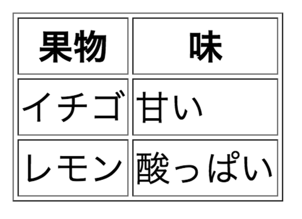
コピー用のHTMLではcaptionを表の名前、theadを見出し行のまとまり、tbodyをデータ行のまとまりに使っています。列見出しにはscope="col"、行見出しならscope="row"を付けると対応が明確になります。外側のtable-scrollは、必要なとき表の中だけを横スクロールするための枠です。HTMLとCSSを両方コピーして使ってください。
▼ 例の解説「見出しセルのth」と「中身のセルのtd」は同じようにtrの中に入れます。結合のない表では各行のセル数を揃えましょう。結合する場合は、結合セルが占める位置も含めて列を揃えます。罫線はHTMLのborder属性ではなくCSSで指定しています。枠線の変え方は後ほど解説します。
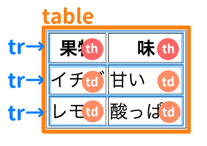
このように対応しているわけですね。この例ではそれぞれの段に入るth・tdの数は2つになっています。
1-3. 見出し行のない表
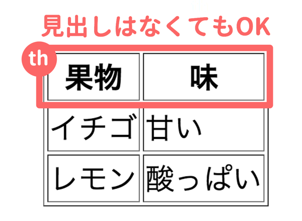
thを使わずに表を書くこともできます。この図は公開当時の説明です。実際のデータ表で見出しと中身を関連付けて読む必要がある場合は、thを使いましょう。色や太字だけでは見出しの意味を伝えられません。
さきほどの例から、見出し行を含むtheadを取り除いてみます。左の列が果物、右の列が味という文脈で読む、見出し行のない構文例です。
<div class="table-scroll" role="region" aria-label="果物の表。必要に応じて横にスクロールできます" tabindex="0">
  <table class="fruit-table">
    <caption>果物と味</caption>
    <tbody>
      <tr>
        <td>イチゴ</td>
        <td>甘い</td>
      </tr>
      <tr>
        <td>レモン</td>
        <td>酸っぱい</td>
      </tr>
    </tbody>
  </table>
</div>.table-scroll {
max-width: 100%;
overflow-x: auto;
}
.table-scroll:focus-visible {
outline: 2px solid #668ad8;
outline-offset: -2px;
}
.fruit-table {
box-sizing: border-box;
border-collapse: separate;
border-spacing: 2px;
border: 1px solid gray;
color: black;
background-color: white;
font-family: Arial, "Hiragino Sans", Meiryo, sans-serif;
font-size: 16px;
line-height: 1.4;
}
.fruit-table caption {
margin-bottom: 6px;
color: black;
font-weight: normal;
text-align: left;
}
.fruit-table th,
.fruit-table td {
border: 1px solid gray;
vertical-align: middle;
white-space: nowrap;
}
.fruit-table th {
padding: 1px;
color: inherit;
background-color: transparent;
font-weight: bold;
text-align: center;
}
.fruit-table td {
padding: 1px;
color: inherit;
text-align: left;
}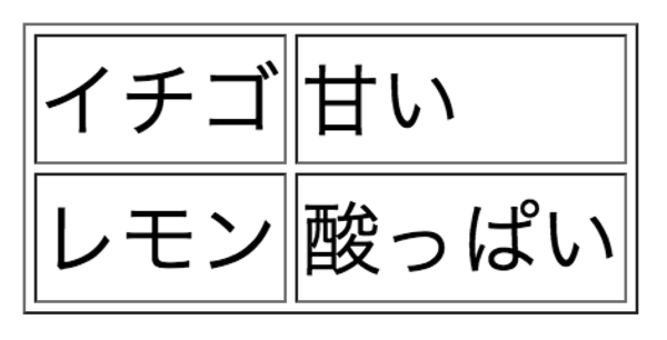
見出しの無い表となりました。
2. 行や列の数を増やす
セルを結合しない表では、trと各行のtd・thを使う数で行数と列数が決まります。いくつか例を見てみましょう。
▼ 例1:4×4の表に
見出しを含めて4×4の表にしたいときは、以下のように書きます。
tableの中にtrを4つ作る(trの数=行数)- 4つのうちの1つの
trの中にはthを4つ作る(=見出しに) - 残りの3つの
trにはtdを4つずつ入れる(=中身のセルに)
これをふまえてコードを書いてみます。
<div class="table-scroll" role="region" aria-label="果物の表。必要に応じて横にスクロールできます" tabindex="0">
  <table class="fruit-table">
    <caption>果物の一覧</caption>
    <thead>
      <tr>
        <th scope="col">果物</th>
        <th scope="col">味</th>
        <th scope="col">色</th>
        <th scope="col">人気</th>
      </tr>
    </thead>
    <tbody>
      <tr>
        <td>イチゴ</td>
        <td>甘い</td>
        <td>赤色</td>
        <td>◎</td>
      </tr>
      <tr>
        <td>リンゴ</td>
        <td>甘い</td>
        <td>赤色</td>
        <td>◯</td>
      </tr>
      <tr>
        <td>レモン</td>
        <td>酸っぱい</td>
        <td>黄色</td>
        <td>△</td>
      </tr>
    </tbody>
  </table>
</div>.table-scroll {
max-width: 100%;
overflow-x: auto;
}
.table-scroll:focus-visible {
outline: 2px solid #668ad8;
outline-offset: -2px;
}
.fruit-table {
box-sizing: border-box;
border-collapse: separate;
border-spacing: 2px;
border: 1px solid gray;
color: black;
background-color: white;
font-family: Arial, "Hiragino Sans", Meiryo, sans-serif;
font-size: 16px;
line-height: 1.4;
}
.fruit-table caption {
margin-bottom: 6px;
color: black;
font-weight: normal;
text-align: left;
}
.fruit-table th,
.fruit-table td {
border: 1px solid gray;
vertical-align: middle;
white-space: nowrap;
}
.fruit-table th {
padding: 1px;
color: inherit;
background-color: transparent;
font-weight: bold;
text-align: center;
}
.fruit-table td {
padding: 1px;
color: inherit;
text-align: left;
}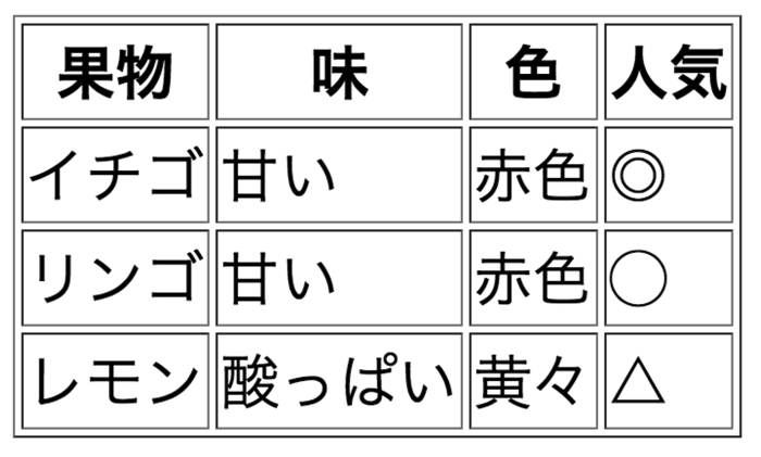
1つの<tr>〜</tr>の中にはthもしくはtdが4つ並んで入るわけですね。
▼ 例2:1行しかない表に
今度は2マスしか無い表を作ってみましょう。
<div class="table-scroll" role="region" aria-label="果物の表。必要に応じて横にスクロールできます" tabindex="0">
  <table class="fruit-table">
    <caption>果物と味</caption>
    <tbody>
      <tr>
        <td>イチゴ</td>
        <td>甘い</td>
      </tr>
    </tbody>
  </table>
</div>.table-scroll {
max-width: 100%;
overflow-x: auto;
}
.table-scroll:focus-visible {
outline: 2px solid #668ad8;
outline-offset: -2px;
}
.fruit-table {
box-sizing: border-box;
border-collapse: separate;
border-spacing: 2px;
border: 1px solid gray;
color: black;
background-color: white;
font-family: Arial, "Hiragino Sans", Meiryo, sans-serif;
font-size: 16px;
line-height: 1.4;
}
.fruit-table caption {
margin-bottom: 6px;
color: black;
font-weight: normal;
text-align: left;
}
.fruit-table th,
.fruit-table td {
border: 1px solid gray;
vertical-align: middle;
white-space: nowrap;
}
.fruit-table th {
padding: 1px;
color: inherit;
background-color: transparent;
font-weight: bold;
text-align: center;
}
.fruit-table td {
padding: 1px;
color: inherit;
text-align: left;
}
2マスだけでも、果物と味の関係を示す表を作れます。こんなこともできるんだな程度に頭に入れておきましょう。
3. 表の余白を変える
tableやth・tdのタグの中に直接スタイル指定を書きこむこともできるのですが、表を作るたびにタグに色々と書き込むのは面倒です。というわけでCSSで表の余白やデザインを指定する方法を紹介していきます。
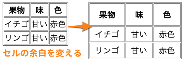
このように1つ1つのセルの余白を大きくしてみましょう。
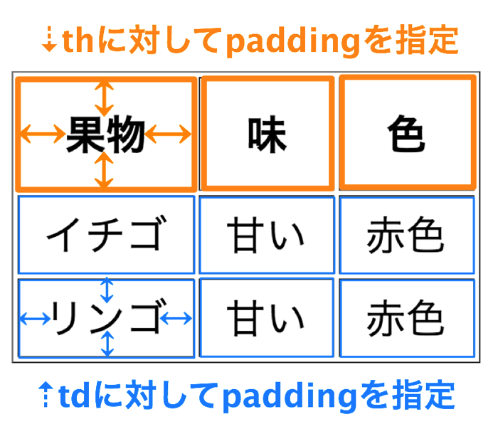
見出しの1つ1つのセル内の余白を変えたいときは、thにpaddingを指定します。それ以外のセルの余白を変えたいときは、tdにpaddingを指定します。
paddingの使い方についてはこちらの記事が参考になるはずです。
CSSのmarginとは?paddingとは?余白の指定方法まとめそれでは実際にコードを書いてみましょう。
<div class="table-scroll" role="region" aria-label="果物の表。必要に応じて横にスクロールできます" tabindex="0">
  <table class="fruit-table">
    <caption>果物の一覧</caption>
    <thead>
      <tr>
        <th scope="col">果物</th>
        <th scope="col">味</th>
        <th scope="col">色</th>
      </tr>
    </thead>
    <tbody>
      <tr>
        <td>イチゴ</td>
        <td>甘い</td>
        <td>赤色</td>
      </tr>
      <tr>
        <td>リンゴ</td>
        <td>甘い</td>
        <td>赤色</td>
      </tr>
    </tbody>
  </table>
</div>.table-scroll {
max-width: 100%;
overflow-x: auto;
}
.table-scroll:focus-visible {
outline: 2px solid #668ad8;
outline-offset: -2px;
}
.fruit-table {
box-sizing: border-box;
border-collapse: separate;
border-spacing: 2px;
border: 1px solid gray;
color: black;
background-color: white;
font-family: Arial, "Hiragino Sans", Meiryo, sans-serif;
font-size: 16px;
line-height: 1.4;
}
.fruit-table caption {
margin-bottom: 6px;
color: black;
font-weight: normal;
text-align: left;
}
.fruit-table th,
.fruit-table td {
border: 1px solid gray;
vertical-align: middle;
white-space: nowrap;
}
.fruit-table th {
padding: 10px;
color: inherit;
background-color: transparent;
font-weight: bold;
text-align: center;
}
.fruit-table td {
padding: 3px 10px;
color: inherit;
text-align: left;
}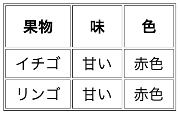
セルまわりの余白が大きくなりました。このように文字まわりの余白を指定することで、tableのサイズを変えることができるのですね。
4. 表の装飾を変える
次に表まわりの装飾を変えてみたいと思います。
4-1. 文字色を変える
まず文字色を変えたいと思います。
table全体の文字色を変えたい場合
⇒CSSでtableに対してcolorを指定します。
<div class="table-scroll" role="region" aria-label="果物の表。必要に応じて横にスクロールできます" tabindex="0">
  <table class="fruit-table">
    <caption>果物の一覧</caption>
    <thead>
      <tr>
        <th scope="col">果物</th>
        <th scope="col">味</th>
        <th scope="col">色</th>
      </tr>
    </thead>
    <tbody>
      <tr>
        <td>イチゴ</td>
        <td>甘い</td>
        <td>赤色</td>
      </tr>
      <tr>
        <td>リンゴ</td>
        <td>甘い</td>
        <td>赤色</td>
      </tr>
    </tbody>
  </table>
</div>.table-scroll {
max-width: 100%;
overflow-x: auto;
}
.table-scroll:focus-visible {
outline: 2px solid #668ad8;
outline-offset: -2px;
}
.fruit-table {
box-sizing: border-box;
border-collapse: separate;
border-spacing: 2px;
border: 1px solid gray;
color: skyblue;
background-color: white;
font-family: Arial, "Hiragino Sans", Meiryo, sans-serif;
font-size: 16px;
line-height: 1.4;
}
.fruit-table caption {
margin-bottom: 6px;
color: black;
font-weight: normal;
text-align: left;
}
.fruit-table th,
.fruit-table td {
border: 1px solid gray;
vertical-align: middle;
white-space: nowrap;
}
.fruit-table th {
padding: 10px;
color: inherit;
background-color: transparent;
font-weight: bold;
text-align: center;
}
.fruit-table td {
padding: 3px 10px;
color: inherit;
text-align: left;
}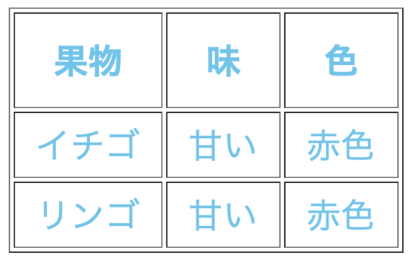
色の違いを示すため、ここでは公開当時のskyblueを残しています。実用時は文字と背景のコントラストも確認しましょう。
ちなみに、tableに指定した文字色はthやtdへ継承されます。セル側で別のcolorを指定した場合は、そちらが優先されます。
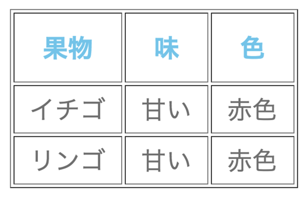
見出しと他のセルで別の色にする
thとtdを別々に指定すれば、以下のように違う色を指定することもできます。
<div class="table-scroll" role="region" aria-label="果物の表。必要に応じて横にスクロールできます" tabindex="0">
  <table class="fruit-table">
    <caption>果物の一覧</caption>
    <thead>
      <tr>
        <th scope="col">果物</th>
        <th scope="col">味</th>
        <th scope="col">色</th>
      </tr>
    </thead>
    <tbody>
      <tr>
        <td>イチゴ</td>
        <td>甘い</td>
        <td>赤色</td>
      </tr>
      <tr>
        <td>リンゴ</td>
        <td>甘い</td>
        <td>赤色</td>
      </tr>
    </tbody>
  </table>
</div>.table-scroll {
max-width: 100%;
overflow-x: auto;
}
.table-scroll:focus-visible {
outline: 2px solid #668ad8;
outline-offset: -2px;
}
.fruit-table {
box-sizing: border-box;
border-collapse: separate;
border-spacing: 2px;
border: 1px solid gray;
color: black;
background-color: white;
font-family: Arial, "Hiragino Sans", Meiryo, sans-serif;
font-size: 16px;
line-height: 1.4;
}
.fruit-table caption {
margin-bottom: 6px;
color: black;
font-weight: normal;
text-align: left;
}
.fruit-table th,
.fruit-table td {
border: 1px solid gray;
vertical-align: middle;
white-space: nowrap;
}
.fruit-table th {
padding: 10px;
color: skyblue;
background-color: transparent;
font-weight: bold;
text-align: center;
}
.fruit-table td {
padding: 3px 10px;
color: gray;
text-align: left;
}
4-2. セルの背景色を変える
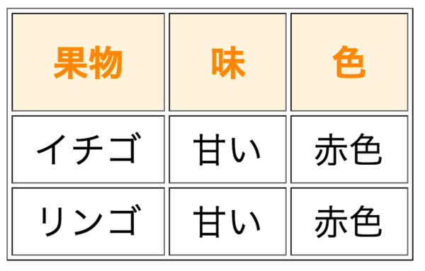
文字色とほとんど同じなので説明するまでも無いかもしれませんが一応…。背景色だけを指定する例ではbackground-colorを使います。backgroundも使えますが、背景の複数の指定をまとめる略記です。見出し(th)の背景色だけを少しベージュっぽくしてみましょう。
<div class="table-scroll" role="region" aria-label="果物の表。必要に応じて横にスクロールできます" tabindex="0">
  <table class="fruit-table">
    <caption>果物の一覧</caption>
    <thead>
      <tr>
        <th scope="col">果物</th>
        <th scope="col">味</th>
        <th scope="col">色</th>
      </tr>
    </thead>
    <tbody>
      <tr>
        <td>イチゴ</td>
        <td>甘い</td>
        <td>赤色</td>
      </tr>
      <tr>
        <td>リンゴ</td>
        <td>甘い</td>
        <td>赤色</td>
      </tr>
    </tbody>
  </table>
</div>.table-scroll {
max-width: 100%;
overflow-x: auto;
}
.table-scroll:focus-visible {
outline: 2px solid #668ad8;
outline-offset: -2px;
}
.fruit-table {
box-sizing: border-box;
border-collapse: separate;
border-spacing: 2px;
border: 1px solid gray;
color: black;
background-color: white;
font-family: Arial, "Hiragino Sans", Meiryo, sans-serif;
font-size: 16px;
line-height: 1.4;
}
.fruit-table caption {
margin-bottom: 6px;
color: black;
font-weight: normal;
text-align: left;
}
.fruit-table th,
.fruit-table td {
border: 1px solid gray;
vertical-align: middle;
white-space: nowrap;
}
.fruit-table th {
padding: 10px;
color: #FF9800;
background-color: #fff5e5;
font-weight: bold;
text-align: center;
}
.fruit-table td {
padding: 3px 10px;
color: inherit;
text-align: left;
}
4-3. 文字を中央寄せする
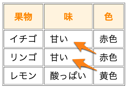
この図は日本語の通常の書字方向で、データセルを左寄せにした公開当時の例です(さきほどの例では文字の長さが同じだったので中央寄せに見えていたのです)。初期の文字寄せはブラウザや継承するCSS、書字方向に依存するので、次の例では明示します。
全てのセルの文字を中央寄せしたいときには、以下のようにthとtdへtext-align: center;を指定しましょう。
<div class="table-scroll" role="region" aria-label="果物の表。必要に応じて横にスクロールできます" tabindex="0">
  <table class="fruit-table">
    <caption>果物の一覧</caption>
    <thead>
      <tr>
        <th scope="col">果物</th>
        <th scope="col">味</th>
        <th scope="col">色</th>
      </tr>
    </thead>
    <tbody>
      <tr>
        <td>イチゴ</td>
        <td>甘い</td>
        <td>赤色</td>
      </tr>
      <tr>
        <td>リンゴ</td>
        <td>甘い</td>
        <td>赤色</td>
      </tr>
      <tr>
        <td>レモン</td>
        <td>酸っぱい</td>
        <td>黄色</td>
      </tr>
    </tbody>
  </table>
</div>.table-scroll {
max-width: 100%;
overflow-x: auto;
}
.table-scroll:focus-visible {
outline: 2px solid #668ad8;
outline-offset: -2px;
}
.fruit-table {
box-sizing: border-box;
border-collapse: separate;
border-spacing: 2px;
border: 1px solid gray;
color: black;
background-color: white;
font-family: Arial, "Hiragino Sans", Meiryo, sans-serif;
font-size: 16px;
line-height: 1.4;
}
.fruit-table caption {
margin-bottom: 6px;
color: black;
font-weight: normal;
text-align: left;
}
.fruit-table th,
.fruit-table td {
border: 1px solid gray;
vertical-align: middle;
white-space: nowrap;
}
.fruit-table th {
padding: 10px;
color: #FF9800;
background-color: #fff5e5;
font-weight: bold;
text-align: center;
}
.fruit-table td {
padding: 3px 10px;
color: inherit;
text-align: center;
}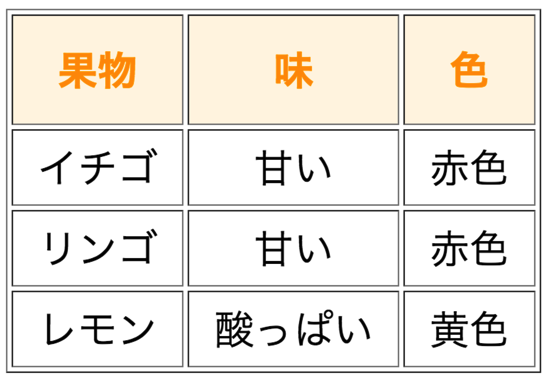
⇡中央寄せになりました。
5. 表の枠線の見た目を変える
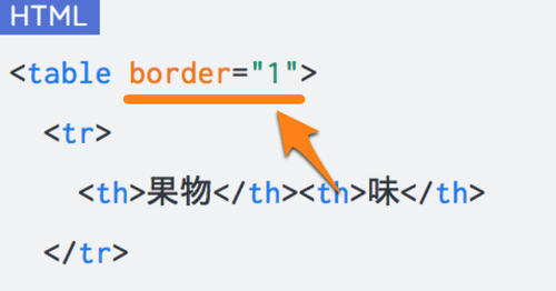
この図は公開当時のtable border="1"という書き方を示しています。HTMLのborder属性は現在のHTMLでは廃止されているので、新しく書くコードでは使いません。この記事のコピー用コードは、初めからCSSで枠線を指定しています。
タグ内で装飾指定をするのは後から変えたくなったときなどに面倒です。線の設定はCSSで行いましょう。ここからは、CSSで線の色や太さを変える方法を紹介します。
5-1. 線の色や太さを指定する
以下のようにthとtdに対してborderを指定します。1つ1つのセルの周りに線をつけているというイメージですね。tableタグにborder属性などを書かないようにしましょう。
<div class="table-scroll" role="region" aria-label="果物の表。必要に応じて横にスクロールできます" tabindex="0">
  <table class="fruit-table">
    <caption>果物の一覧</caption>
    <thead>
      <tr>
        <th scope="col">果物</th>
        <th scope="col">味</th>
        <th scope="col">色</th>
      </tr>
    </thead>
    <tbody>
      <tr>
        <td>イチゴ</td>
        <td>甘い</td>
        <td>赤色</td>
      </tr>
      <tr>
        <td>リンゴ</td>
        <td>甘い</td>
        <td>赤色</td>
      </tr>
    </tbody>
  </table>
</div>.table-scroll {
max-width: 100%;
overflow-x: auto;
}
.table-scroll:focus-visible {
outline: 2px solid #668ad8;
outline-offset: -2px;
}
.fruit-table {
box-sizing: border-box;
border-collapse: separate;
border-spacing: 2px;
border: none;
color: black;
background-color: white;
font-family: Arial, "Hiragino Sans", Meiryo, sans-serif;
font-size: 16px;
line-height: 1.4;
}
.fruit-table caption {
margin-bottom: 6px;
color: black;
font-weight: normal;
text-align: left;
}
.fruit-table th,
.fruit-table td {
border: 1px solid black;
vertical-align: middle;
white-space: nowrap;
}
.fruit-table th {
padding: 10px;
color: #FF9800;
background-color: #fff5e5;
font-weight: bold;
text-align: center;
}
.fruit-table td {
padding: 3px 10px;
color: inherit;
text-align: center;
}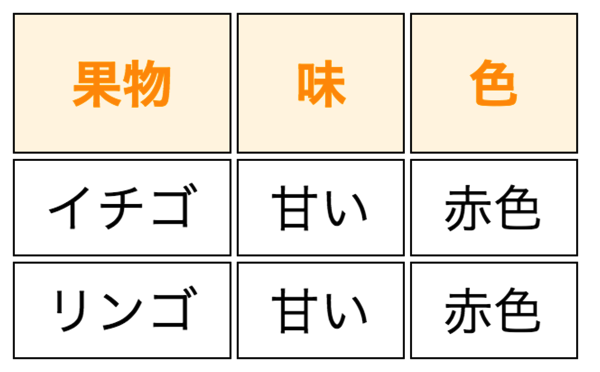
この例ではborder-collapse: separate;で各セルに独立した線を付け、border-spacing: 2px;でセル間に隙間を作っています。
5-2. 隙間を無くして一重線にする
一重線に変えるにはtableに対してborder-collapse: collapse;と指定します。※ collapseは隣接セルの罫線を共有し、separateは個別に持たせます。border-spacingはseparate時のセル間隔、paddingはセル内の余白です。
<div class="table-scroll" role="region" aria-label="果物の表。必要に応じて横にスクロールできます" tabindex="0">
  <table class="fruit-table">
    <caption>果物の一覧</caption>
    <thead>
      <tr>
        <th scope="col">果物</th>
        <th scope="col">味</th>
        <th scope="col">色</th>
      </tr>
    </thead>
    <tbody>
      <tr>
        <td>イチゴ</td>
        <td>甘い</td>
        <td>赤色</td>
      </tr>
      <tr>
        <td>リンゴ</td>
        <td>甘い</td>
        <td>赤色</td>
      </tr>
    </tbody>
  </table>
</div>.table-scroll {
max-width: 100%;
overflow-x: auto;
}
.table-scroll:focus-visible {
outline: 2px solid #668ad8;
outline-offset: -2px;
}
.fruit-table {
box-sizing: border-box;
border-collapse: collapse;
border-spacing: 0;
border: none;
color: black;
background-color: white;
font-family: Arial, "Hiragino Sans", Meiryo, sans-serif;
font-size: 16px;
line-height: 1.4;
}
.fruit-table caption {
margin-bottom: 6px;
color: black;
font-weight: normal;
text-align: left;
}
.fruit-table th,
.fruit-table td {
border: 1px solid black;
vertical-align: middle;
white-space: nowrap;
}
.fruit-table th {
padding: 10px;
color: #FF9800;
background-color: #fff5e5;
font-weight: bold;
text-align: center;
}
.fruit-table td {
padding: 3px 10px;
color: inherit;
text-align: center;
}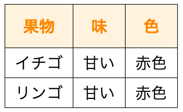
無事に一重線になりました。あとは線の太さを変えるなり、色を変えるなり自由にスタイリングしましょう。
▼スタイリング例
<div class="table-scroll" role="region" aria-label="果物の表。必要に応じて横にスクロールできます" tabindex="0">
  <table class="fruit-table">
    <caption>果物の一覧</caption>
    <thead>
      <tr>
        <th scope="col">果物</th>
        <th scope="col">味</th>
        <th scope="col">色</th>
      </tr>
    </thead>
    <tbody>
      <tr>
        <td>イチゴ</td>
        <td>甘い</td>
        <td>赤色</td>
      </tr>
      <tr>
        <td>リンゴ</td>
        <td>甘い</td>
        <td>赤色</td>
      </tr>
    </tbody>
  </table>
</div>.table-scroll {
max-width: 100%;
overflow-x: auto;
}
.table-scroll:focus-visible {
outline: 2px solid #668ad8;
outline-offset: -2px;
}
.fruit-table {
box-sizing: border-box;
border-collapse: collapse;
border-spacing: 0;
border: 2px solid orange;
color: black;
background-color: white;
font-family: Arial, "Hiragino Sans", Meiryo, sans-serif;
font-size: 16px;
line-height: 1.4;
}
.fruit-table caption {
margin-bottom: 6px;
color: black;
font-weight: normal;
text-align: left;
}
.fruit-table th,
.fruit-table td {
border: 1px dashed orange;
vertical-align: middle;
white-space: nowrap;
}
.fruit-table th {
padding: 10px;
color: #FF9800;
background-color: #fff5e5;
font-weight: bold;
text-align: center;
}
.fruit-table td {
padding: 3px 10px;
color: inherit;
text-align: center;
}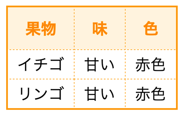
各セルのまわりの罫線を破線(dashed)にしてみました。点線はdottedです。表全体を別の線で囲いたいときは、table側へborder: 2px solid orange;のように指定します。
6. 複数のセルを結合する
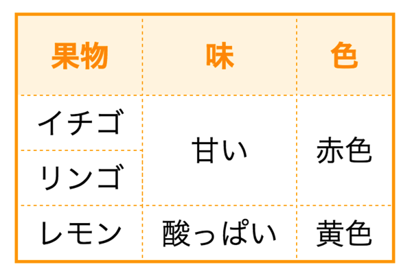
複数のセルをつなげて1つのセルにすることもできます。重複する項目があるときに便利ですね。
6-1. rowspanで縦方向につなげる
縦方向に並ぶ複数のセルをつなげたいときは、つなげる起点となるthもしくはtdタグにrowspan="つなげるセル数"と書き込みます。
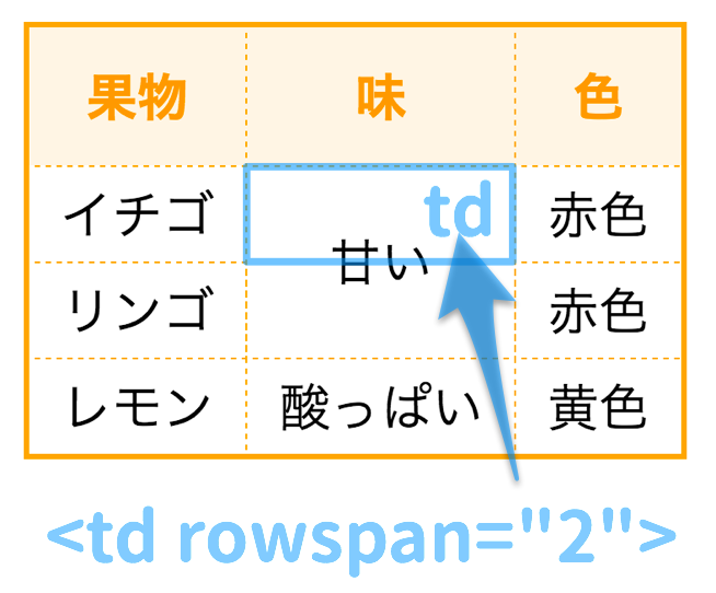
例えばこの図のように「甘い」というセルを2行分に結合したい場合は、上側のtdタグの中にrowspan="2"と書き込みます。指定したセルが2行分の位置を占めます。各行の高さが違う場合などには、単純に高さが2倍になるとは限りません。
その下のtd(リンゴの右隣)は、結合セルがすでに占めている位置なので省きます。ここにもセルを追加すると、列がずれたり余分な列ができたりします。この例では同じtbody内の2行を結合しています。
▼コード例
<div class="table-scroll" role="region" aria-label="果物の表。必要に応じて横にスクロールできます" tabindex="0">
  <table class="fruit-table">
    <caption>果物の一覧</caption>
    <thead>
      <tr>
        <th scope="col">果物</th>
        <th scope="col">味</th>
        <th scope="col">色</th>
      </tr>
    </thead>
    <tbody>
      <tr>
        <td>イチゴ</td>
        <td rowspan="2">甘い</td>
        <td>赤色</td>
      </tr>
      <tr>
        <td>リンゴ</td>
        <td>赤色</td>
      </tr>
      <tr>
        <td>レモン</td>
        <td>酸っぱい</td>
        <td>黄色</td>
      </tr>
    </tbody>
  </table>
</div>.table-scroll {
max-width: 100%;
overflow-x: auto;
}
.table-scroll:focus-visible {
outline: 2px solid #668ad8;
outline-offset: -2px;
}
.fruit-table {
box-sizing: border-box;
border-collapse: collapse;
border-spacing: 0;
border: 2px solid orange;
color: black;
background-color: white;
font-family: Arial, "Hiragino Sans", Meiryo, sans-serif;
font-size: 16px;
line-height: 1.4;
}
.fruit-table caption {
margin-bottom: 6px;
color: black;
font-weight: normal;
text-align: left;
}
.fruit-table th,
.fruit-table td {
border: 1px dashed orange;
vertical-align: middle;
white-space: nowrap;
}
.fruit-table th {
padding: 10px;
color: #FF9800;
background-color: #fff5e5;
font-weight: bold;
text-align: center;
}
.fruit-table td {
padding: 3px 10px;
color: inherit;
text-align: center;
}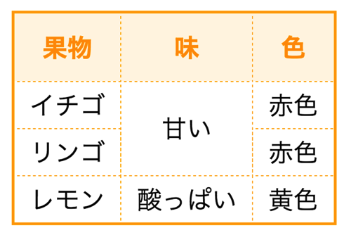
セルが縦につながりました。このときCSSの指定はとくに変える必要はありません。
6-2. colspanで横につなげる
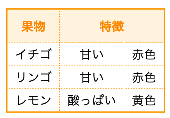
横につなげたいときはcolspanを使います。使い方はrowspanと全く同じでthかtdタグのどちらかにcolspan="つなげる数"と書き込みます。名前が似ていて覚えづらいですね…。
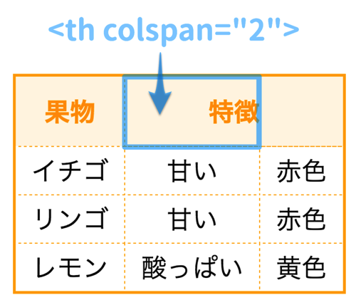
たとえば、この図では「果物」の隣のthにcolspan="2"と書きます。これでセルが2列分の位置を占めます。結合する右隣のthは省きます。幅が必ず2倍になるという指定ではありません。
▼使用例
少し変わった表現にしてみます。上の図は2列を結合した例でしたが、次はtrタグ(=行)を1番上にもう1つ増やし、その中に3列分の見出しセルを入れます。colgroup span="3"で列グループを定義し、上段はscope="colgroup"、次の段はscope="col"で見出しの範囲を示します。
<div class="table-scroll" role="region" aria-label="果物の表。必要に応じて横にスクロールできます" tabindex="0">
  <table class="fruit-table">
    <caption>果物の一覧</caption>
    <colgroup span="3"></colgroup>
    <thead>
      <tr>
        <th colspan="3" scope="colgroup">果物</th>
      </tr>
      <tr>
        <th scope="col">名前</th>
        <th scope="col">特徴</th>
        <th scope="col">色</th>
      </tr>
    </thead>
    <tbody>
      <tr>
        <td>イチゴ</td>
        <td>甘い</td>
        <td>赤色</td>
      </tr>
      <tr>
        <td>リンゴ</td>
        <td>甘い</td>
        <td>赤色</td>
      </tr>
      <tr>
        <td>レモン</td>
        <td>酸っぱい</td>
        <td>黄色</td>
      </tr>
    </tbody>
  </table>
</div>.table-scroll {
max-width: 100%;
overflow-x: auto;
}
.table-scroll:focus-visible {
outline: 2px solid #668ad8;
outline-offset: -2px;
}
.fruit-table {
box-sizing: border-box;
border-collapse: collapse;
border-spacing: 0;
border: 2px solid orange;
color: black;
background-color: white;
font-family: Arial, "Hiragino Sans", Meiryo, sans-serif;
font-size: 16px;
line-height: 1.4;
}
.fruit-table caption {
margin-bottom: 6px;
color: black;
font-weight: normal;
text-align: left;
}
.fruit-table th,
.fruit-table td {
border: 1px dashed orange;
vertical-align: middle;
white-space: nowrap;
}
.fruit-table th {
padding: 10px;
color: #FF9800;
background-color: #fff5e5;
font-weight: bold;
text-align: center;
}
.fruit-table td {
padding: 3px 10px;
color: inherit;
text-align: center;
}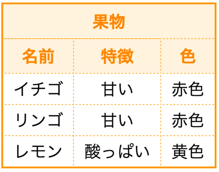
どこかで使えそうな表現ですね。
7. 表の幅を変える
最後に表の幅を変える方法を紹介します。
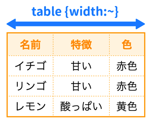
表全体の幅を変えるには、tableに対してwidthを指定します。たとえば幅を300pxにしたいときはwidth: 300px;と書きます。ただし、セル内容の最小幅などによっては指定幅を超える場合があります。次の例は300pxの表を、横スクロールできるtable-scrollの中に入れています。
<div class="table-scroll" role="region" aria-label="幅300pxの果物の表。横にスクロールできます" tabindex="0">
  <table class="fruit-table">
    <caption>果物の一覧</caption>
    <thead>
      <tr>
        <th scope="col">名前</th>
        <th scope="col">特徴</th>
        <th scope="col">色</th>
      </tr>
    </thead>
    <tbody>
      <tr>
        <td>イチゴ</td>
        <td>甘い</td>
        <td>赤色</td>
      </tr>
      <tr>
        <td>リンゴ</td>
        <td>甘い</td>
        <td>赤色</td>
      </tr>
      <tr>
        <td>レモン</td>
        <td>酸っぱい</td>
        <td>黄色</td>
      </tr>
    </tbody>
  </table>
</div>.table-scroll {
max-width: 100%;
overflow-x: auto;
}
.table-scroll:focus-visible {
outline: 2px solid #668ad8;
outline-offset: -2px;
}
.fruit-table {
box-sizing: border-box;
border-collapse: collapse;
border-spacing: 0;
border: 2px solid orange;
color: black;
background-color: white;
font-family: Arial, "Hiragino Sans", Meiryo, sans-serif;
font-size: 16px;
line-height: 1.4;
width: 300px;
}
.fruit-table caption {
margin-bottom: 6px;
color: black;
font-weight: normal;
text-align: left;
}
.fruit-table th,
.fruit-table td {
border: 1px dashed orange;
vertical-align: middle;
white-space: nowrap;
}
.fruit-table th {
padding: 10px;
color: #FF9800;
background-color: #fff5e5;
font-weight: bold;
text-align: center;
}
.fruit-table td {
padding: 3px 10px;
color: inherit;
text-align: center;
}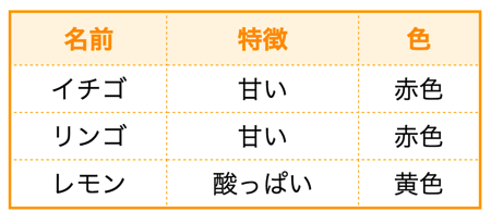
↑横幅300px
この例では表の幅が300pxになるように各列の幅が調整されます。表示する場所が狭いときは、表の外側の枠内を横にスクロールして見られます。
レスポンシブデザインにするときは
width: 100%;なら親要素の幅を基準にできます。ただし、長い内容やセルの最小幅によっては表がはみ出す場合があるので、100%だけで必ず収まるとは限りません。横スクロール用の枠で囲むなど、狭い画面でも内容を読めるようにしましょう。