

記事内に商品プロモーションが含まれる場合があります
今回はul/ol/liを使った箇条書き(リスト)のデザイン例を紹介します。リストのHTMLとCSSで作るデザインです。アイコンを使う例では、Font AwesomeのWeb Fontsの読み込みも必要です。記事内の画像は公開当時の表示例です。メニューリストとして使っても、記事内でポイントをまとめるときに使っても良いでしょう。それぞれCSSコードを載せていますので、コピペしてご自由にお使いください。
1. シンプルなリストデザイン
まずは単純な例から紹介していきます。ほとんどがulとli、olとliのどちらでも使うことができます。
1-1.モノクロ
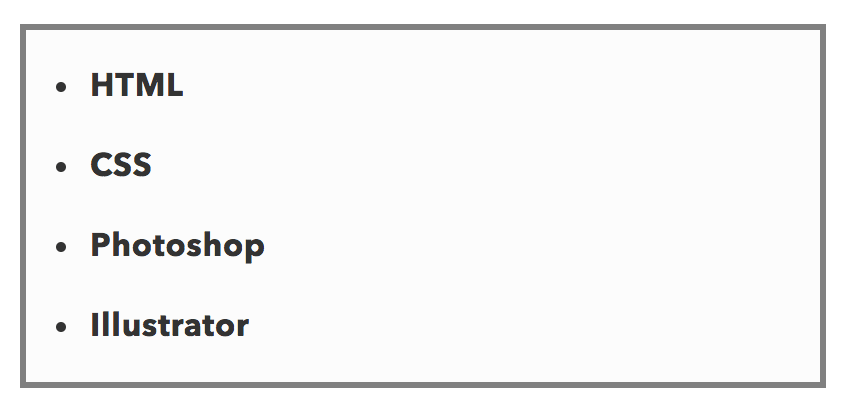
モノクロでシンプルな箇条書きです。デザインを崩さずにさらっと使うことができるかと思います。
ul, ol {
  background: #fcfcfc;/*背景色*/
  padding: 0.5em 0.5em 0.5em 2em;/*ボックス内の余白*/
  border: solid 3px gray;/*線の種類 太さ 色*/
}

ul li, ol li {
  line-height: 1.5; /*文の行高*/
  padding: 0.5em 0; /*前後の文との余白*/
}
1-2.爽やか
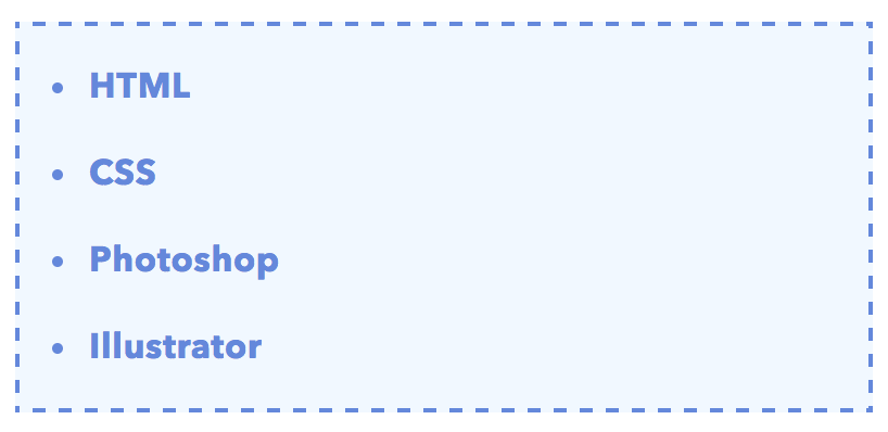
青の破線で囲み、爽やかな印象を出しました。
ul, ol {
  color: #668ad8;/*文字色*/
  border: dashed 2px #668ad8;/*破線 太さ 色*/
  background: #f1f8ff; /*背景色*/
  padding: 0.5em 0.5em 0.5em 2em;
}

ul li, ol li {
  line-height: 1.5;
  padding: 0.5em 0;
}
二重線バージョン
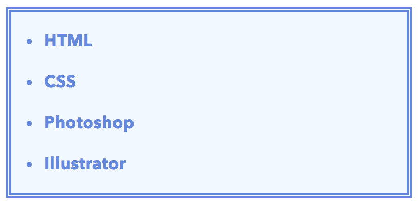
borderをdoubleにして線を太めにするとこうなります。
ul, ol {
  color: #668ad8;
  border: double 5px #668ad8;/*二重線 太さ 色*/
  background: #f1f8ff;
  padding: 0.5em 0.5em 0.5em 2em;
}

ul li, ol li {
  line-height: 1.5;
  padding: 0.5em 0;
}
1-3.上下のみボーダー
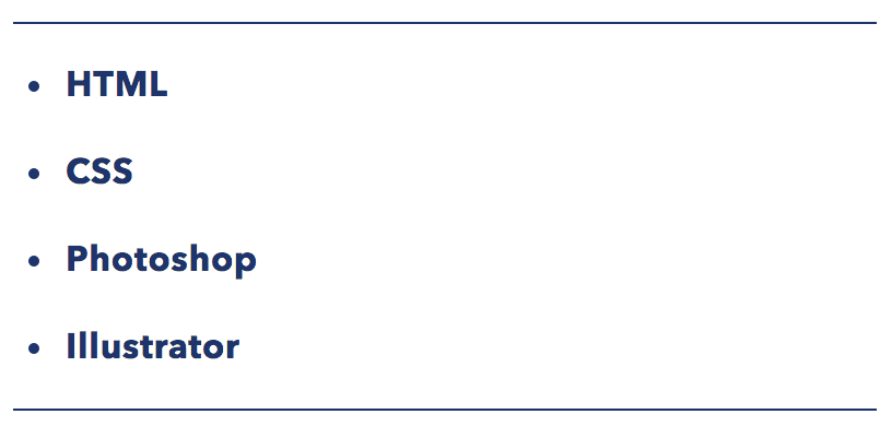
左右のborderを取ってみました。少しスマートな印象になりますね。上下の線はもう少し太くしても良いでしょう。
ul, ol {
  color: #1e366a;
  border-top: solid #1e366a 1px;/*上のボーダー*/
  border-bottom: solid #1e366a 1px;/*下のボーダー*/
  padding: 0.5em 0 0.5em 1.5em;
}

ul li, ol li {
  line-height: 1.5;
  padding: 0.5em 0;
}
1-4.クール
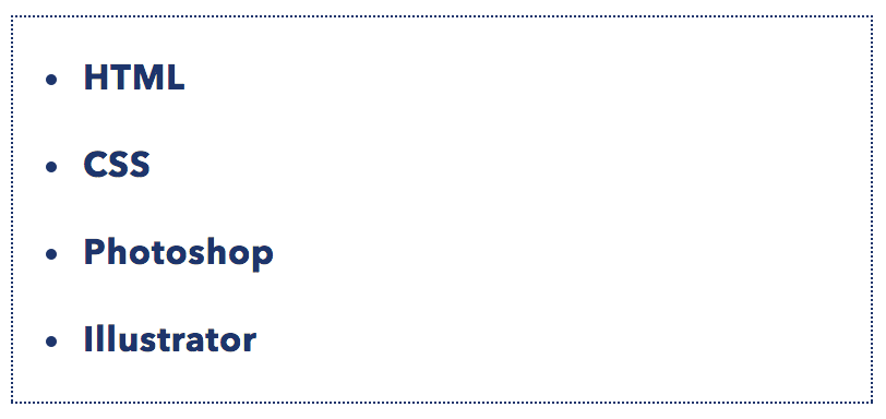
1pxのドット線で囲いました。色は自由に変えましょう。
ul, ol {
  color: #1e366a;
  border: dotted #1e366a 1px;/*ドット 色 太さ*/
  padding: 0.5em 0.5em 0.5em 2em;
}

ul li, ol li {
  line-height: 1.5;
  padding: 0.5em 0;
}
1-5. シャドウボックス
全体に影をつけました。立体感があり、目を引きやすくなるかもしれませんね。
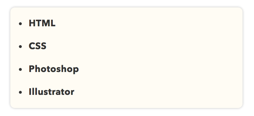
ul, ol {
  background: #fffcf4;
  border-radius :8px;/*角の丸み*/
  box-shadow :0px 0px 5px silver;/*5px=影のぼかし半径*/
  padding: 0.5em 0.5em 0.5em 2em;
}
ul li, ol li {
  line-height: 1.5;
  padding: 0.5em 0;
}
背景色を変えた場合
背景(background)を灰色にしてみると以下のようになります。
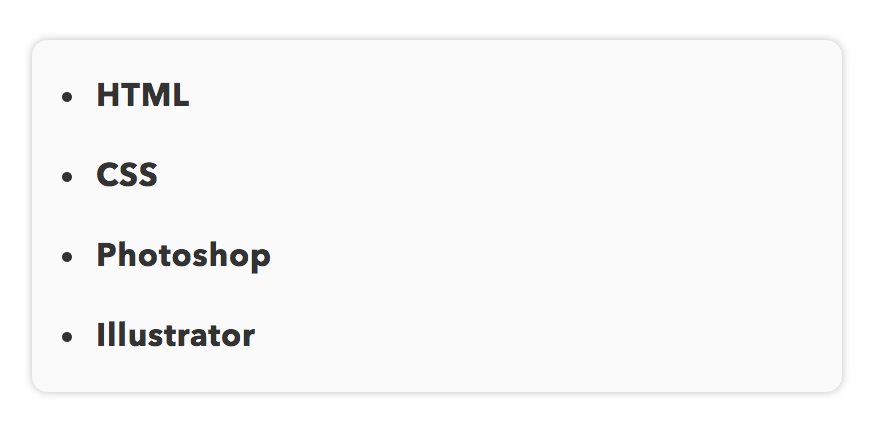
ul, ol {
  background: #dadada;/*灰色に*/
  border-radius :8px;
  box-shadow :0px 0px 5px silver;
  padding: 0.5em 0.5em 0.5em 2em;
}
ul li, ol li {
  line-height: 1.5;
  padding: 0.5em 0;
}
1-6.ステッチ風
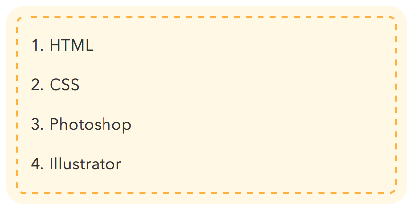
内側に破線を入れて、ステッチ風にしてみました。かわいい雰囲気のウェブサイトやブログにはマッチするでしょう。
ul, ol {
  background: #fffde8;
  box-shadow: 0px 0px 0px 10px #fffde8;/*線の外側*/
  border: dashed 2px #ffb03f;/*破線*/
  border-radius: 9px;
  margin-left: 10px;/*はみ出ないように調整*/
  margin-right: 10px;/*はみ出ないように調整*/
  padding: 0.5em 0.5em 0.5em 2em;
}

ul li, ol li {
  line-height: 1.5;
  padding: 0.5em 0;
}
色を変えてみた場合
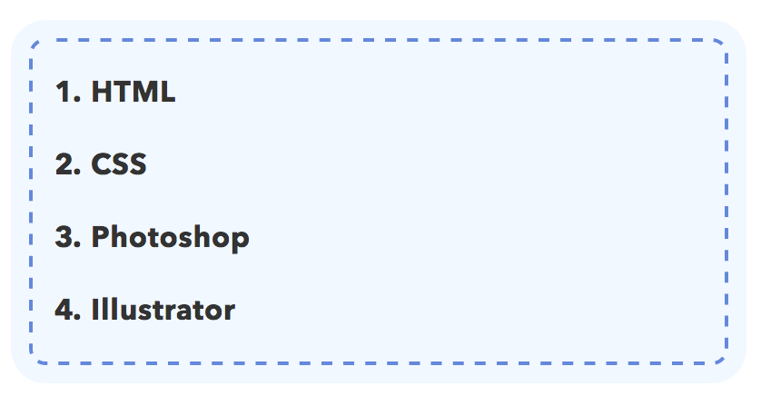
青色バージョンだと以下のようになります。
ul, ol {
  background: #f1f8ff;
  box-shadow: 0px 0px 0px 10px #f1f8ff;/*線の外側*/
  border: dashed 2px #668ad8;/*破線*/
  border-radius: 9px;
  margin-left: 10px;/*はみ出ないように調整*/
  margin-right: 10px;/*はみ出ないように調整*/
  padding: 0.5em 0.5em 0.5em 2em;
}

ul li, ol li {
  line-height: 1.5;
  padding: 0.5em 0;
}
1-7.付箋風
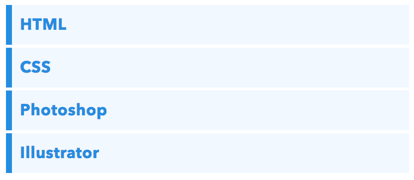
見出しに使われるようなバーを並べてみました。メニューや目次に使うと良いかもしれないですね。
ul, ol {
  padding: 0;
  position: relative;
}

ul li, ol li {
  color: #2d8fdd;
  border-left: solid 6px #2d8fdd;/*左側の線*/
  background: #f1f8ff;/*背景色*/
  margin-bottom: 3px;/*下のバーとの余白*/
   line-height: 1.5;
  padding: 0.5em;
  list-style: none;/*ポチ消す*/
}
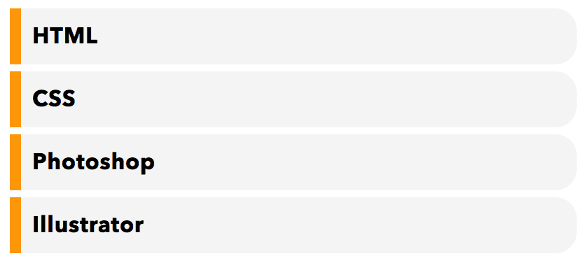
右端を丸くしてみた場合
右側の端を丸くすると、少しかわいくなります。
ul, ol {
  padding: 0;
  position: relative;
}

ul li, ol li {
  color: black;
  border-left: solid 8px orange;/*左側の線*/
  background: whitesmoke;/*背景色*/
  margin-bottom: 5px;/*下のバーとの余白*/
  line-height: 1.5;
  border-radius: 0 15px 15px 0;/*右側の角だけ丸く*/
  padding: 0.5em;
  list-style: none;
}
グレイの下線を足してみると…
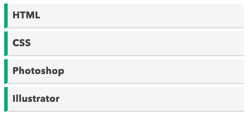
グレイの下線を足して影のようにしました。左側の緑の部分の色はお好みで変えましょう。
ul, ol {
  padding: 0;
}

ul li, ol li {
  color: #404040;
  border-left: solid 6px #1fa67a;/*左側の線*/
  border-bottom: solid 2px #dadada;/*下に灰色線*/
  background: whitesmoke;
  margin-bottom: 5px;/*下のバーとの余白*/
  line-height: 1.5;
  padding: 0.5em;
  list-style: none;/*ポチ消す*/
  font-weight: bold;
}
1-8.タグ風
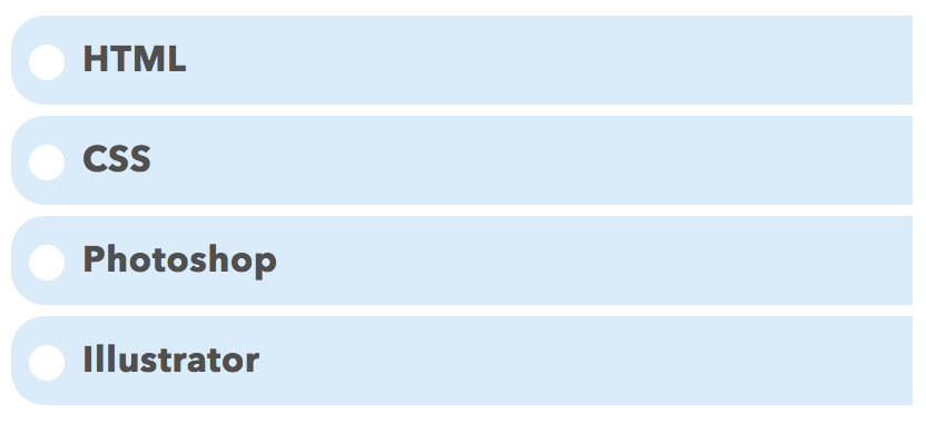
白色の円を配置すると穴のようになり、タグに見えますね。これは番号付きの箇条書き(olとli)では使えません。
ul {
  padding: 0;
}

ul li {
  position: relative;
  list-style: none;/*ポチ消す*/
  padding: 0.5em 0.5em 0.5em 0.5em;
  margin-bottom: 5px;
  line-height: 1.5;
  background: #dbebf8;
  vertical-align: middle;
  color: #505050;
  border-radius: 15px 0px 0px 15px;/*左側の角丸く*/
}

ul li::before{
  display:inline-block;
  vertical-align: middle;
  /*以下白丸つくる*/
  content:'';
  width:1em;
  height: 1em;
  background: #fff;
  border-radius: 50%;
  margin-right: 8px;
}
2.アイコンフォントでulの箇条書きをおしゃれに
Font Awesomeという「簡単にウェブサイト上でアイコンを表示できるサービス」を使えば、よりリストデザインの幅が広がります。FontAwesomeの使い方は以下で解説しています(とっても簡単です)。
【保存版】Font Awesomeの使い方:Webアイコンフォントを使おう各例は単独で使うCSSです。実際のページでは専用クラスを付けて適用範囲を絞り、既存のリスト装飾と競合する場合はセレクターや読み込み順を調整してください。
【参考】アイコンを黒ポチ代わりに使う方法
ulの黒ポチの代わりにアイコンフォントを使う場合、CSSで以下のような書き方をします。
黒ポチを消す:
ulに対してlist-style: noneを指定liの疑似要素を作る:
li::beforeでアイコンを表示させるpositionでアイコンの位置調整:配置の基準にする
ulまたはliをposition: relativeに、li::beforeをposition: absoluteに
疑似要素というのは、ものすごくざっくり言うと「要素の前後に何かをくっつける」ためのものです。ここではアイコンを前にくっつけます。ちょっとややこしいと思うので、よく分からないという方はCSSコード例をとりあえずコピペしてみて頂ければと思います。
2-1. シェブロンマーク
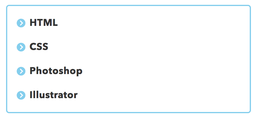
黒ポチ代わりにシェブロンマーク()を使います。シンプルでどんなデザインにも馴染むかと思います。自分の好きな色を変えて使うと良いでしょう。
ul {
  border: solid 2px skyblue;
  border-radius: 5px;
  padding: 0.5em 1em 0.5em 2.3em;
  position: relative;
}

ul li {
  line-height: 1.5;
  padding: 0.5em 0;
  list-style: none;
}

ul li::before {

  font-family: "Font Awesome 7 Free";
  font-weight: 900;
  font-style: normal;
  content: "\f138";/*アイコンの種類*/
  position: absolute;
  left : 1em;/*左端からのアイコンまでの距離*/
  color: skyblue;/*アイコン色*/
}
2-2.ふきだしアイコン
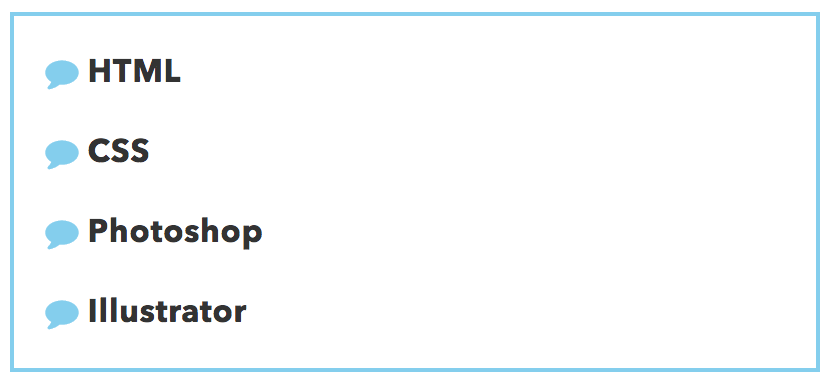
ポチ代わりに吹き出しアイコンを使ってみました。多用すると少しくどく見えてしまうかもしれませんが、目は引きそうです。
ul {
  border: solid 2px skyblue;/*線の設定*/
  padding: 0.5em 1em 0.5em 2.3em;
  position: relative;
}

ul li {
  line-height: 1.5;
  padding: 0.5em 0;
  list-style: none;
}

ul li::before {

  font-family: "Font Awesome 7 Free";
  font-weight: 900;
  font-style: normal;
  content: "\f075";/*アイコンの種類*/
  position: absolute;
  left : 1em; /*左端からのアイコンまで*/
  color: skyblue; /*アイコン色*/
}
2-3.チェックリスト
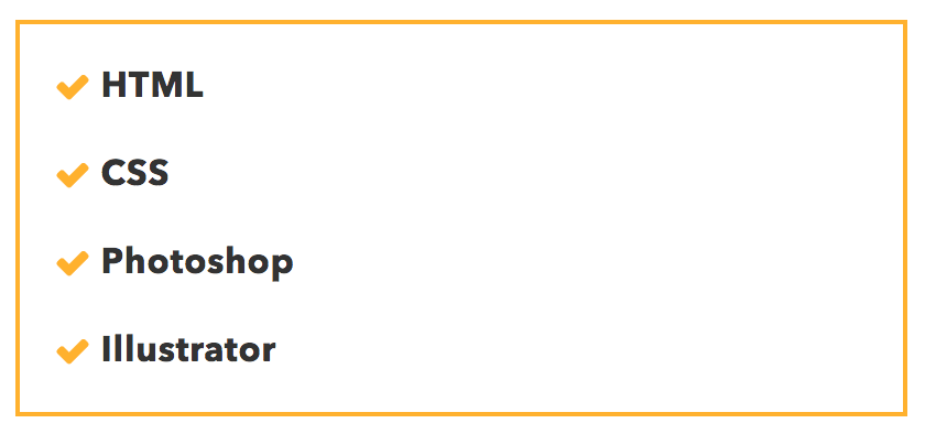
チェックマークにしても良いでしょう。個人的にはこのくらいが見やすくて好きです。
ul {
  border: solid 2px #ffb03f;
  padding: 0.5em 1em 0.5em 2.3em;
  position: relative;
}

ul li {
  line-height: 1.5;
  padding: 0.5em 0;
  list-style: none;/*ポチ消す*/
}

ul li::before {
  font-family: "Font Awesome 7 Free";
  font-weight: 900;
  font-style: normal;
  content: "\f00c";
  position: absolute;
  left : 1em; /*左端からのアイコンまで*/
  color: #ffb03f; /*アイコン色*/
}
2-4.指差し
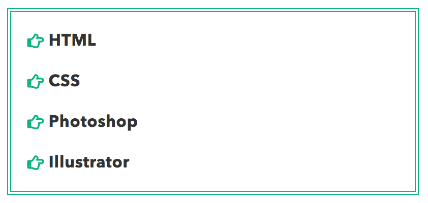
指差しマークかつ枠を二重線にしてみました。
ul {
  border: double 4px #21b384;
  padding: 0.5em 1em 0.5em 2.3em;
  position: relative;
}
ul li {
  line-height: 1.5;
  padding: 0.5em 0;
  list-style: none;/*ポチ消す*/
}
ul li::before {
  font-family: "Font Awesome 7 Free";
  font-weight: 900;
  font-style: normal;
  content: "\f0a4";
  position: absolute;
  left : 1em; /*左端からのアイコンまで*/
  color: #21b384; /*アイコン色*/
}
2-5.肉球
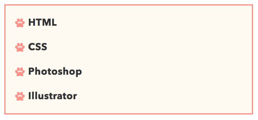
ペットブログなら肉球アイコンを使わない手はないでしょう。せっかくなので色もかわいらしいものにしてみました。
ul {
  border: solid 2px #ff938b;
  background: #fffaf1;
  padding: 0.5em 1em 0.5em 2.3em;
  position: relative;
}

ul li {
  line-height: 1.5;
  padding: 0.5em 0;
  list-style: none;/*ポチ消す*/
}

ul li::before {
  font-family: "Font Awesome 7 Free";
  font-weight: 900;
  font-style: normal;
  content: "\f1b0";/*アイコン種類*/
  position: absolute;
  left : 1em; /*左端からのアイコンまで*/
  color: #ff938b; /*アイコン色*/
}
2-6.ひかえめ
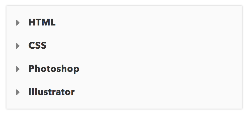
三角マークを使ってみました。周辺にはうっすらと影をつけて少し目立つようにしてみてはどうでしょうか。
ul {
  box-shadow :0px 0px 3px silver;
  border: solid 1px whitesmoke;
  padding: 0.5em 1em 0.5em 2.3em;
  position: relative;
  background: #fafafa;
}

ul li {
  line-height: 1.5;
  padding: 0.5em 0;
  list-style: none;
}

ul li::before {
  font-family: "Font Awesome 7 Free";
  font-weight: 900;
  font-style: normal;
  content: "\f0da";
  position: absolute;
  left : 1em; /*左端からのアイコンまで*/
  color: gray; /*アイコン色*/
}
2-7.立体的なバー
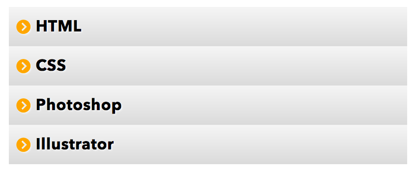
立体感を出してみました。記事内で使うにはあまり向いていません。主にメニュー用ですね。
ul {
  padding: 0;
  position: relative;
}

ul li {
  line-height: 1.5;
  padding: 0.5em 0.5em 0.5em 1.7em;
  list-style: none;
  background: linear-gradient(to bottom, whitesmoke 0%, #dadada 100%);/*グラデーション*/
  text-shadow: 1px 1px 1px whitesmoke;/*文字を立体的に*/
  color: black;
}

ul li::before {
  font-family: "Font Awesome 7 Free";
  font-weight: 900;
  font-style: normal;
  content: "\f138";
  position: absolute;
  left : 0.5em; /*左端からのアイコンまでの距離*/
  color: orange; /*アイコン色*/
}
青色バージョン
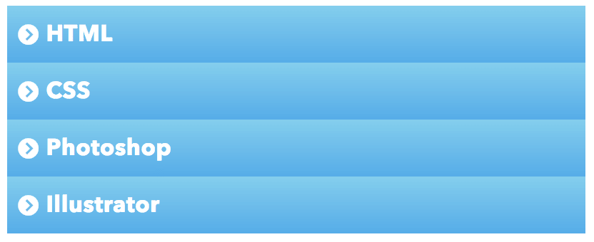
青色に変えてみました。さわやかな印象が出ますね。
ul {
  padding: 0;
  position: relative;
}
ul li {
  line-height: 1.5;
  padding: 0.5em 0.5em 0.5em 1.7em;
  list-style: none;
  background: linear-gradient(to bottom, skyblue 0%, #5aade6 100%);/*グラデーション*/
  color: #fff;
}

ul li::before {
  font-family: "Font Awesome 7 Free";
  font-weight: 900;
  font-style: normal;
  content: "\f138";
  position: absolute;
  left : 0.5em;
  color: white;
}
2-8.区切り線付き
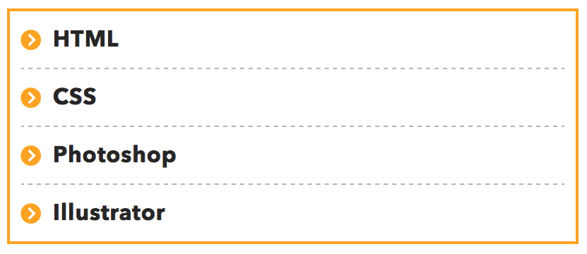
liの下に区切り線をつけることで文同士の境目がハッキリとして見やすくなります。
ul {
  border: solid 2px #ffb03f;
  padding: 0 0.5em;
  position: relative;
}

ul li {
  line-height: 1.5;
  padding: 0.5em 0 0.5em 1.4em;
  border-bottom: dashed 1px silver;
  list-style: none;
}

ul li::before {
  font-family: "Font Awesome 7 Free";
  font-weight: 900;
  font-style: normal;
  content: "\f138";/*アイコン種類*/
  position: absolute;
  left : 0.5em; /*左端からのアイコンまで*/
  color: #ffb03f; /*アイコン色*/
}

ul li:last-of-type {
  border-bottom: none;
}
白線で区切ってみた場合
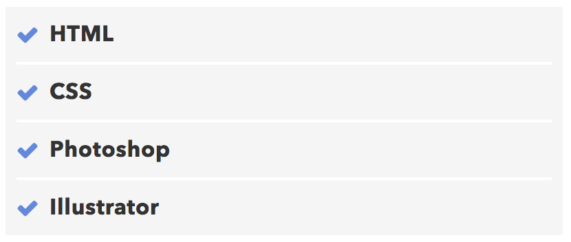
背景に色がついている場合は白色の実線や点線で区切っても良いでしょう。
ul {
  background: whitesmoke;
  padding: 0 0.5em;
  position: relative;
}

ul li {
  line-height: 1.5;
  padding: 0.5em 0 0.5em 1.5em;
  border-bottom: 2px solid white;
  list-style: none;
}

ul li::before {
  font-family: "Font Awesome 7 Free";
  font-weight: 900;
  font-style: normal;
  content: "\f00c";/*アイコン種類*/
  position: absolute;
  left : 0.5em; /*左端からのアイコンまで*/
  color: #668ad8; /*アイコン色*/
}

ul li:last-of-type {
  border-bottom: none;/*最後の線だけ消す*/
}
2-9.フラット
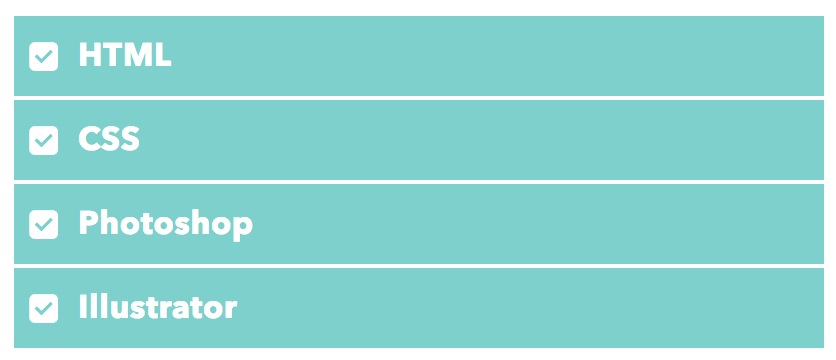
フラットデザイン用です。淡い色を使うとフラットデザインらしく可愛くなります。また、太字と合わせると良いですね。
ul {
  padding: 0;
  position: relative;
}

ul li {
  color: white;
  background: #81d0cb;
  line-height: 1.5;
  padding: 0.5em 0.5em 0.5em 2em;
  border-bottom: 2px solid white;
  list-style: none;
  font-weight: bold; /*好みで太字に*/
}

ul li::before {
  font-family: "Font Awesome 7 Free";
  font-weight: 900;
  font-style: normal;
  content: "\f14a";
  position: absolute;
  left : 0.5em; /*左端からのアイコンまでの距離*/
  color: white; /*アイコン色*/
}
青×破線区切りの場合
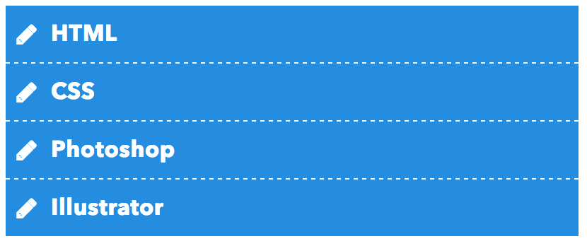
青の背景で区切り線を破線にしてみました。少しシャープな印象になりました。
ul {
  padding: 0;
  position: relative;
}
ul li {
  color: white;
  background: #2d8fdd;
  line-height: 1.5;
  padding: 0.5em 0.5em 0.5em 2em;
  border-bottom: 1px dashed white;
  list-style: none;
}
ul li::before {
  font-family: "Font Awesome 7 Free";
  font-weight: 900;
  font-style: normal;
  content: "\f303";
  position: absolute;
  left : 0.5em/*左端からのアイコンまでの距離*/;
  color: white;/*アイコン色*/
}
ul li:last-of-type {
  border-bottom: none;/*最後のliの線だけ消す*/
}
アイコンの背景を四角く塗りつぶした場合
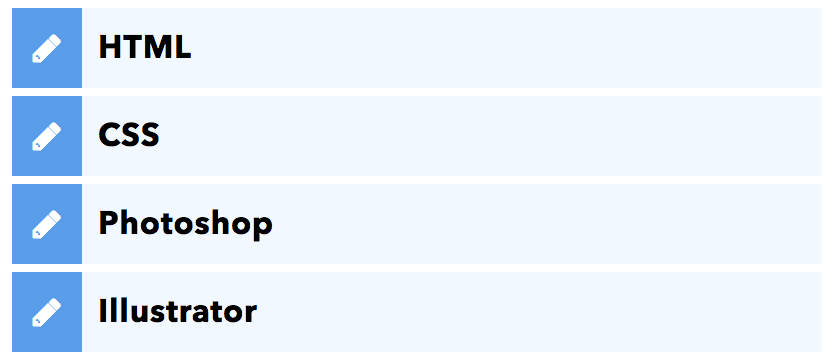
アイコンの裏だけ濃いめの色で塗りつぶしてみました。アイコン種類は自由に置き換えましょう。
ul {
  padding: 0;
}

ul li {
  color: black;
  position:relative;
  background: #f1f8ff;/*バーの色*/
  line-height: 1.5;
  padding: 0.5em;
  margin-bottom: 4px;
  border-left : solid 35px #5c9ee7;/*先の色=アイコン裏の色*/
  list-style: none;
}

ul li::before {
  font-family: "Font Awesome 7 Free";
  font-weight: 900;
  font-style: normal;
  content: "\f303";
  position: absolute;
  display: block;
  padding: 0.5em;
  width: 1.2em;
  color: white; /*アイコン色*/
  text-align: center;
  left : -35px; /*左端からのアイコンまでの距離*/
  /*以下 上下中央寄せのため*/
  top: 50%;
  transform: translateY(-50%);
}
3.オシャレなolリストのデザイン
番号付きのリストもオシャレにしてみましょう。参考までに数字のデザインを変えるCSSの書き方は以下のようになります。
- 数字を一旦消す:
list-style-type:noneを使う - カウンタを新しく作る:
counter-increment:好きなカウンタ名 - カウンタを一旦リセット:
counter-reset:カウンタ名 - カウンタを表示:
content:counter(カウンタ名)
以下の例ではカウンタ名をnumberとし、1から昇順に数えます。HTMLのolのstart・reversedやliのvalue属性は、この独自カウンタには自動で反映されません。開始番号や逆順が必要な場合は標準の番号表示を使うか、カウンタも合わせて調整してください。
3-1.円で番号を囲う
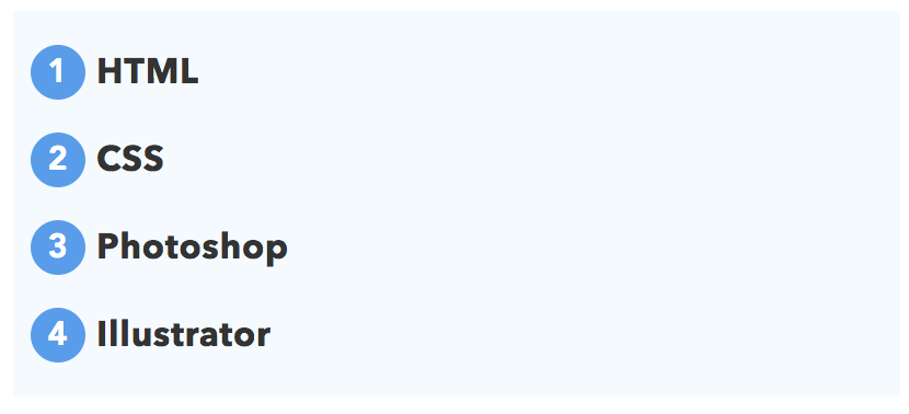
数字を丸で囲んでみました。これだけでかなり華やかな雰囲気が出ますね。
ol {
  counter-reset:number; /*数字をリセット*/
  list-style: none; /*数字を一旦消す*/
  padding:0.5em;
  background: #f5faff;
}
ol li {
  position: relative;
  padding-left: 30px;
  line-height: 1.5em;
  padding: 0.5em 0.5em 0.5em 30px;
}

ol li::before{
  /* 以下数字をつける */
  position: absolute;
  counter-increment: number;
  content: counter(number);
  /*以下数字のデザイン変える*/
  display:inline-block;
  background: #5c9ee7;
  color: white;
  font-family: 'Avenir','Arial Black','Arial',sans-serif;
  font-weight:bold;
  font-size: 15px;
  border-radius: 50%;
  left: 0;
  width: 25px;
  height: 25px;
  line-height: 25px;
  text-align: center;
  /*以下 上下中央寄せのため*/
  top: 50%;
  transform: translateY(-50%);
}
liの下に破線をつけた場合
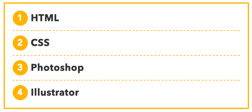
下線を足すとさらに見やすくなるでしょう。ただし多用すると くどく感じられてしまうかもしれません。
ol {
  counter-reset:number; /*数字をリセット*/
  list-style: none; /*数字を一旦消す*/
  padding: 0.3em 0.8em;
  border: solid 2px #ffb107;
}
ol li {
  border-bottom: dashed 1px orange;
  position: relative;
  padding: 0.5em 0.5em 0.5em 30px;
  line-height: 1.5em;
}
ol li::before{
  /* 以下数字をつける */
  position: absolute;
  counter-increment: number;
  content: counter(number);
  /*数字のデザイン変える*/
  display:inline-block;
  background: #ffb107;
  color: white;
  font-family: 'Avenir','Arial Black','Arial',sans-serif;
  font-weight:bold;
  font-size: 15px;
  border-radius: 50%;
  left: 0;
  width: 25px;
  height: 25px;
  line-height: 25px;
  text-align: center;
  /*以下 上下中央寄せのため*/
  top: 50%;
  transform: translateY(-50%);
}
ol li:last-of-type {
  border-bottom: none; /*最後のliの線だけ消す*/
}
3-2.番号をブロックに
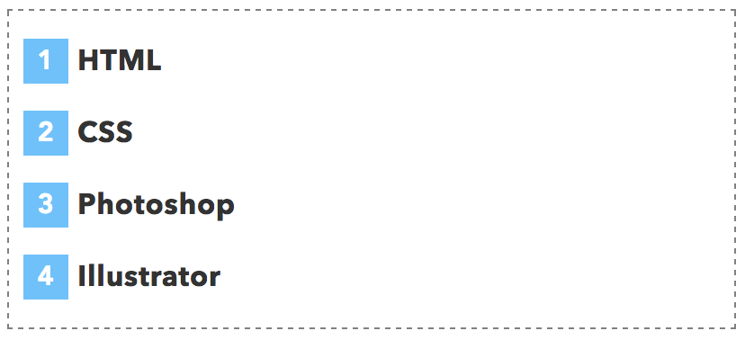
四角バージョンです。破線で囲ってみましたが、実線を使っても、背景色を塗りつぶしても良いかもしれませんね。
ol {
  counter-reset:number; /*数字をリセット*/
  list-style: none; /*数字を一旦消す*/
  padding:0.5em;
  border: dashed 1px gray;
}

ol li {
  position: relative;
  line-height: 1.5em;
  padding: 0.5em 0.5em 0.5em 30px;
}

ol li::before{
  /* 以下数字をつける */
  position: absolute;
  counter-increment: number;
  content: counter(number);
  /*数字のデザイン変える*/
  display:inline-block;
  background: #74c2f8;
  color: white;
  font-family: 'Avenir','Arial Black','Arial',sans-serif;
  font-weight:bold;
  font-size: 15px;
  left: 0;
  width: 25px;
  height: 25px;
  line-height: 25px;
  text-align: center;
  /*以下上下中央寄せのため*/
  top: 50%;
  transform: translateY(-50%);
}
番号を四角で塗りつぶしたサンプル
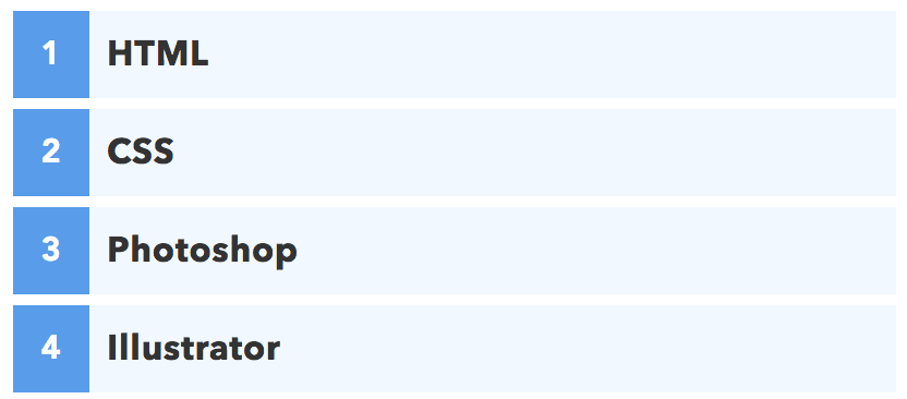
番号の背後だけを青く塗りつぶしました。目次に使うと良いかもしれませんね
ol {
  counter-reset:number; /*数字をリセット*/
  list-style: none; /*数字を一旦消す*/
  padding:0;
}
ol li {
  position: relative;
  padding: 0.5em;
  line-height: 1.5em;
  background: #f1f8ff;
  border-left : solid 35px #5c9ee7;
  margin-bottom: 5px;
}
ol li::before{
  /* 以下数字をつける */
  position: absolute;
  counter-increment: number;
  content: counter(number);
  /*数字のデザイン変える*/
  display:inline-block;
  color: white;
  font-family: 'Avenir','Arial Black','Arial',sans-serif;
  font-weight:bold;
  font-size: 15px;
  top: 50%;
  transform: translateY(-50%);
  left: -35px;
  width: 35px;
  height: 1em;
  line-height: 1;
  text-align: center;
}
3-3.手書き風
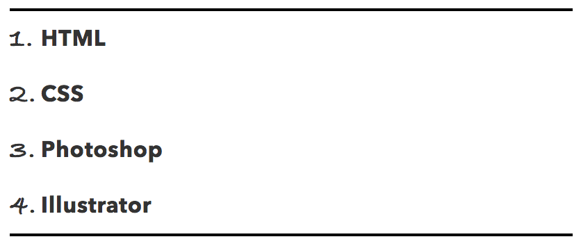
数字を手書き風に変えてもユニークに見えますね。指定したフォントが端末にインストールされていれば、そのフォントで表示されます。どれもなければsans-serifにフォールバックするので、OS名だけでは見た目を保証できません。同じ書体を使いたい場合は、Google FontsなどのWebフォントを読み込んで指定しましょう。
ol {
  counter-reset:number; /*数字をリセット*/
  list-style: none; /*数字を一旦消す*/
  padding:0;
  border-top: solid 2px black;
  border-bottom: solid 2px black;
}
ol li {
  padding: 0.5em 0;
  position: relative;
  padding-left: 1.4em;
  line-height: 1.5em;
}
ol li::before{
  counter-increment: number;
  content: counter(number) ".";
  position: absolute;
  left: 0;
  font-family: 'Bradley Hand','Segoe Script','Segoe Print',sans-serif;/*手書き風のフォント*/
  font-size: 1.3em;/*フォントサイズ*/
}
3-4.番号をふきだしに
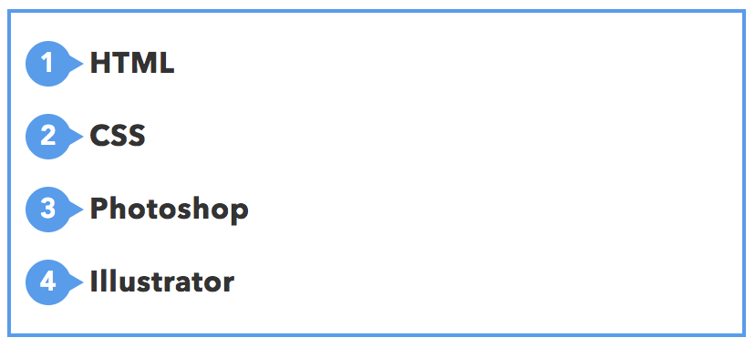
番号を吹き出し風にすればユニークで目をひくデザインになりますね。こちらも数字のデザインが重要になります。同じ書体を使いたい場合はGoogle FontsなどのWebフォントを読み込んで指定しましょう。
ol {
  counter-reset:number; /*数字をリセット*/
  list-style: none; /*数字を一旦消す*/
  padding:0.5em;
  border: solid 2px #5c9ee7;
}
ol li {
  position: relative;
  padding: 0.5em 0.5em 0.5em 35px;
  line-height: 1.5em;
}
ol li::before{
  /* 以下数字をつける */
  position: absolute;
  counter-increment: number;
  content: counter(number);
  /*数字のデザイン変える*/
  display:inline-block;
  background: #5c9ee7;
  color: white;
  font-family: 'Avenir','Arial Black','Arial',sans-serif;
  font-weight:bold;
  font-size: 15px;
  border-radius: 50%;/*円にする*/
  left: 0;
  width: 25px;
  height: 25px;
  line-height: 25px;
  text-align: center;
  /*以下 上下中央寄せのため*/
  top: 50%;
  transform: translateY(-50%);
}
ol li::after {/*吹き出しのちょこんと出た部分*/
  content: '';
  display: block;
  position: absolute;
  left: 20px;/*左からの位置*/
  height: 0;
  width: 0;
  border-top: 7px solid transparent;
  border-bottom: 7px solid transparent;
  border-left: 12px solid #5c9ee7;
  /*以下 上下中央寄せのため*/
  top: 50%;
  transform: translateY(-50%);
}
4.リストにタイトルタブをつける
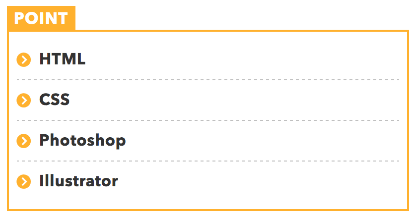
ボックスの上にタブのように文字をつけることができます。下のコードの"POINT"の文字を書きかえて使いましょう。「ポイント」や「まとめ」、「重要」「コラム」などの文字をつけると良いですね。
ul {
  border: solid 2px #ffb03f;
  padding: 0.5em;
  position: relative;
  margin-top: 2em;
}
ul li {
  line-height: 1.5;
  padding: 0.5em 0 0.5em 1.4em;
  border-bottom: dashed 1px silver;
  list-style: none;
}
ul li:last-of-type {
  border-bottom: none;
}
ul li::before {
  /*リスト内のアイコン*/
  font-family: "Font Awesome 7 Free";
  font-weight: 900;
  font-style: normal;
  content: "\f138";/*アイコン種類*/
  position: absolute;
  left : 0.5em; /*左端からのアイコンまで*/
  color: #ffb03f; /*アイコン色*/
}
ul::after {
  /*タイトルタブ*/
  background: #ffb03f;
  color: #fff;
  font-weight: bold;
  position: absolute;
  left: -2px;
  bottom: 100%;
  padding: 1px 7px;
  content: "POINT";/*タブの文字*/
  letter-spacing: 0.05em;/*字間*/
}
この例ではulを使っていますが、olでも同じように作ることができます。
タグにアイコンを入れた場合
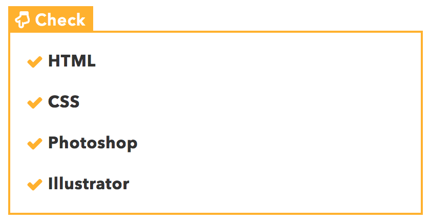
合わせ技でタグ内にアイコンフォントを入れることもできます。content:'\f0a7 Check';の\f0a7の部分がアイコン種類を表しています。詳しい書き方は「Font AwesomeをCSSで使う方法」をご覧ください。
ul {
  border: solid 2px #ffb03f;
  padding: 0.5em 1em 0.5em 2.3em;
  position: relative;
  margin-top: 2em;
}
ul li {
  line-height: 1.5;
  padding: 0.5em 0;
  list-style: none;
}
ul li::before {
  /*リストのアイコン*/
  font-family: "Font Awesome 7 Free";
  font-weight: 900;
  font-style: normal;
  content: "\f00c";
  position: absolute;
  left : 1em; /*左端からのアイコンまでの距離*/
  color: #ffb03f; /*アイコン色*/
}
ul::after {
  /*タブ*/
  background: #ffb03f;
  color: #fff;
  font-family: Arial, "Font Awesome 7 Free", sans-serif;
  font-weight: 900;
  font-style: normal;
  position: absolute;
  left: -2px;
  bottom: 100%;
  padding: 1px 7px;
  content: '\f0a7  Check';/*アイコンコード+文字*/
  letter-spacing: 0.05em;/*字間*/
}
5. 余白や文字の太さを調整する
ここまで紹介してきた例では、リスト外の余白を考慮していません。リスト内外の余白を調整したいときは、こちらの記事を参考にすると良いかと思います。
【HTML&CSS】箇条書きの余白とインデントの調整方法また、文字は好みで太字にすると良いでしょう。
【CSS】font-weightで文字の太さを変える方法:効かないときは?