記事内に商品プロモーションが含まれる場合があります
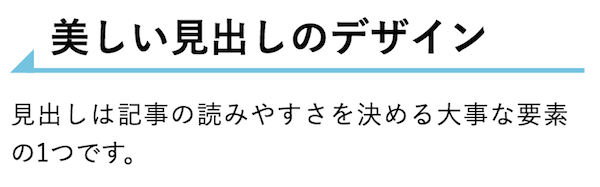
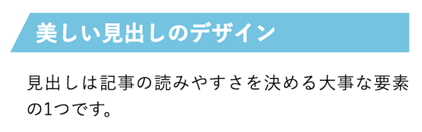
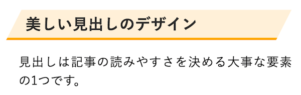
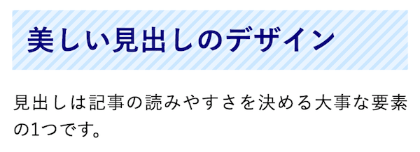
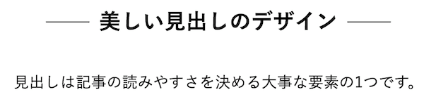
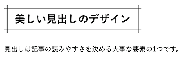
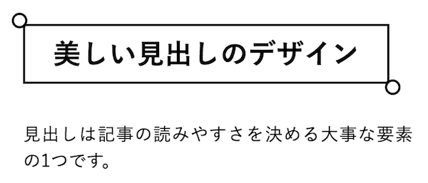
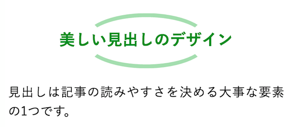
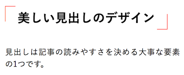
今回は見出し(h1〜h6タグ)のオシャレなデザインサンプルを68種類紹介します。CSSコードを自分の見出しに合わせて使えます。もちろん自分好みにカスタマイズして使って頂いても構いません。
あわせて読みたいCSSが効かない・反映されないときの対処法まとめ
デザインがうまく反映されないときは、こちらの記事を参考にしてみてください。
1. シンプルな見出し
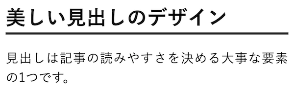
下線付き
コードを表示
CSSh1 {
/*線の種類(実線) 太さ 色*/
border-bottom: solid 3px black;
}
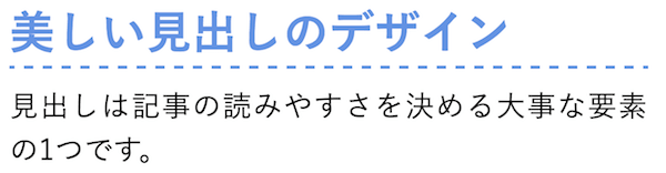
破線+色を変える
コードを表示
CSSh1 {
color: #6594e0;/*文字色*/
/*破線・太さ・色*/
border-bottom: dashed 2px #6594e0;
}
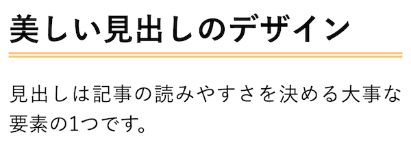
二重線
コードを表示
CSSh1 {
/*線の種類(二重線)太さ 色*/
border-bottom: double 5px #FFC778;
}
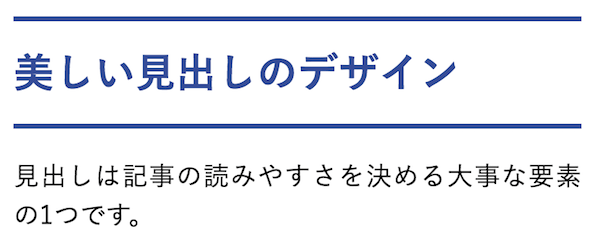
上下に線
コードを表示
CSSh1 {
color: #364e96;/*文字色*/
padding: 0.5em 0;/*上下の余白*/
border-top: solid 3px #364e96;/*上線*/
border-bottom: solid 3px #364e96;/*下線*/
}
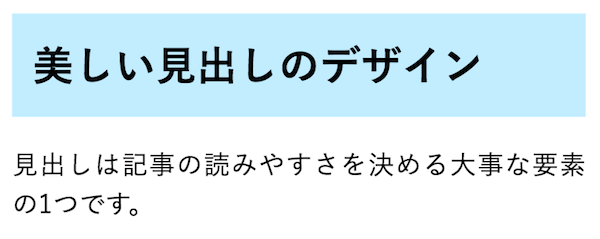
単純な背景色をつける
コードを表示
CSSh1 {
background: #c2edff;/*背景色*/
padding: 0.5em;/*文字まわり(上下左右)の余白*/
}
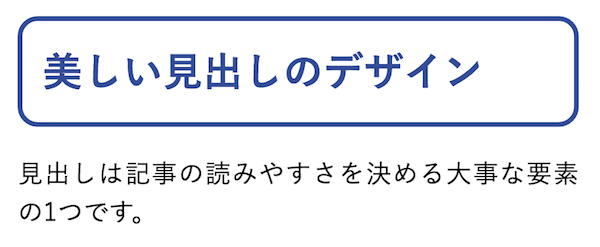
全体を線で囲む
コードを表示
CSSh1 {
color: #364e96;/*文字色*/
border: solid 3px #364e96;/*線色*/
padding: 0.5em;/*文字周りの余白*/
border-radius: 0.5em;/*角丸*/
}
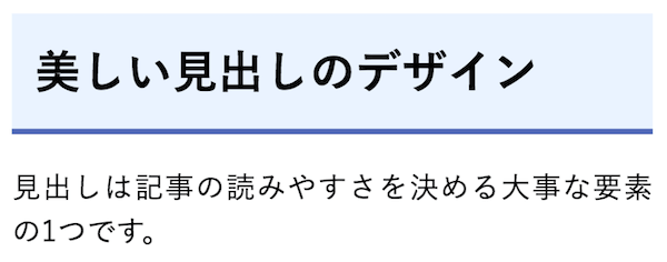
背景色+下線
コードを表示
CSSh1 {
padding: 0.5em;/*文字周りの余白*/
color: #010101;/*文字色*/
background: #eaf3ff;/*背景色*/
border-bottom: solid 3px #516ab6;/*下線*/
}
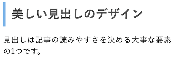
左線
コードを表示
CSSh1 {
padding: 0.25em 0.5em;/*上下 左右の余白*/
color: #494949;/*文字色*/
background: transparent;/*背景透明に*/
border-left: solid 5px #7db4e6;/*左線*/
}
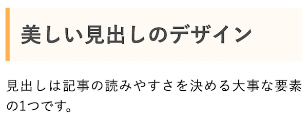
左に線+塗り
コードを表示
CSSh1 {
padding: 0.5em;/*文字周りの余白*/
color: #494949;/*文字色*/
background: #fffaf4;/*背景色*/
border-left: solid 5px #ffaf58;/*左線(実線 太さ 色)*/
}
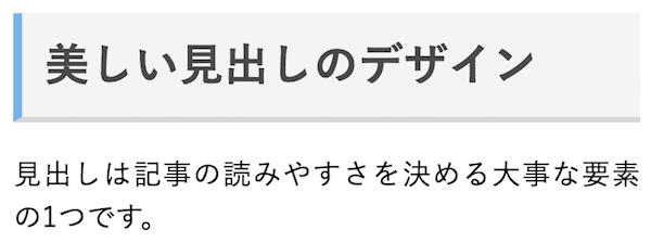
立体感のあるバー
コードを表示
CSSh1 {
padding: 0.4em 0.5em;/*文字の上下 左右の余白*/
color: #494949;/*文字色*/
background: #f4f4f4;/*背景色*/
border-left: solid 5px #7db4e6;/*左線*/
border-bottom: solid 3px #d7d7d7;/*下線*/
}
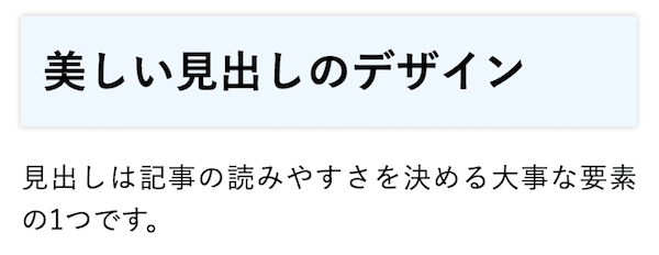
シンプルなボックスシャドウ
コードを表示
CSSh1 {
padding: 0.5em;
background: aliceblue;
box-shadow: 0 0 4px rgba(0, 0, 0, 0.23);
}
2. おしゃれ系デザイン
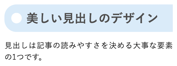
タグ風
コードを表示
CSSh1 {
color: #505050;/*文字色*/
padding: 0.5em;/*文字周りの余白*/
display: inline-block;/*見出しを文字幅に合わせる*/
line-height: 1.3;/*行高*/
background: #dbebf8;/*背景色*/
vertical-align: middle;
border-radius: 25px 0px 0px 25px;/*左側の角を丸く*/
}
h1::before {
content: '●';
color: white;
margin-right: 8px;
}
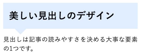
吹き出し
コードを表示
CSSh1 {
position: relative;
padding: 0.6em;
background: #e0edff;
}
h1::after {
position: absolute;
content: '';
top: 100%;
left: 30px;
border: 15px solid transparent;
border-top: 15px solid #e0edff;
width: 0;
height: 0;
}
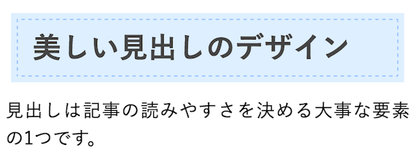
ステッチ風
コードを表示
CSSh1 {
background: #dfefff;
box-shadow: 0px 0px 0px 5px #dfefff;
border: dashed 1px #96c2fe;
padding: 0.2em 0.5em;
color: #454545;
}
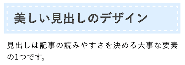
ステッチを白に
コードを表示
CSSh1 {
background: #dfefff;
box-shadow: 0px 0px 0px 5px #dfefff;
border: dashed 2px white;
padding: 0.2em 0.5em;
}
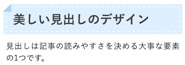
角がぺろっと剥がれるデザイン
コードを表示
CSSh1 {
position: relative;
background: #dfefff;
box-shadow: 0px 0px 0px 5px #dfefff;
border: dashed 2px white;
padding: 0.2em 0.5em;
color: #454545;
}
h1::after {
position: absolute;
content: '';
left: -7px;
top: -7px;
border-width: 0 0 15px 15px;
border-style: solid;
border-color: #fff #fff #a8d4ff;
box-shadow: 1px 1px 1px rgba(0, 0, 0, 0.15);
}
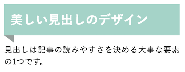
帯(リボン)風
コードを表示
CSSh1 {
position: relative;
padding: 0.5em;
background: #a6d3c8;
color: white;
}
h1::before {
position: absolute;
content: '';
top: 100%;
left: 0;
border: none;
border-bottom: solid 15px transparent;
border-right: solid 20px rgb(149, 158, 155);
}
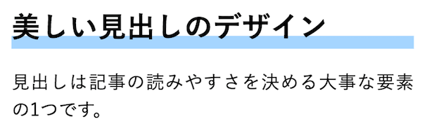
蛍光マーカー風
コードを表示
CSSh1 {
background: linear-gradient(transparent 70%, #a7d6ff 70%);
}
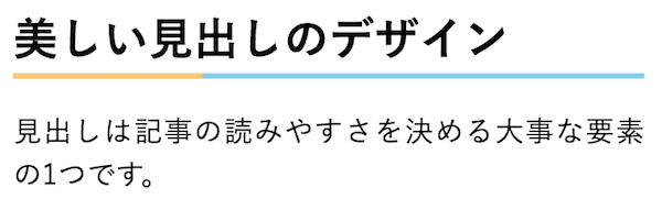
途中で色の変わる線
コードを表示
CSSh1 {
border-bottom: solid 3px skyblue;
position: relative;
}
h1::after {
position: absolute;
content: " ";
display: block;
border-bottom: solid 3px #ffc778;
bottom: -3px;
width: 30%;
}
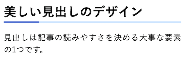
色を変えてみた場合
コードを表示
CSSh1 {
border-bottom: solid 3px #cce4ff;
position: relative;
}
h1::after {
position: absolute;
content: " ";
display: block;
border-bottom: solid 3px #5472cd;
bottom: -3px;
width: 20%;
}
線先に矢印
コードを表示
CSSh1 {
position: relative;
padding-left: 25px;
}
h1::before {
position: absolute;
content: '';
bottom: -3px;
left: 0;
width: 0;
height: 0;
border: none;
border-left: solid 15px transparent;
border-bottom: solid 15px rgb(119, 195, 223);
}
h1::after {
position: absolute;
content: '';
bottom: -3px;
left: 10px;
right: 0;
border-bottom: solid 3px rgb(119, 195, 223);
}
先端が尖ったようなバー
コードを表示
CSSh1 {
position: relative;
isolation: isolate;
padding: 5px 5px 5px 42px;
background: #77c3df;
font-size: 20px;
color: white;
margin-left: -33px;
line-height: 1.3;
z-index: 0;
}
h1::before {
position: absolute;
content: '';
left: -2px;
top: -2px;
border: none;
border-left: solid 40px white;
border-bottom: solid 79px transparent;
z-index: 1;
}
両先端を尖らせた場合
コードを表示
CSSh1 {
position: relative;
isolation: isolate;
padding: 5px 26px 5px 42px;
background: #fff0d9;
font-size: 20px;
color: #2d2d2d;
margin-left: -33px;
line-height: 1.3;
border-bottom: solid 3px orange;
z-index: 0;
}
h1::before {
position: absolute;
content: '';
left: -2px;
top: -2px;
width: 0;
height: 0;
border: none;
border-left: solid 40px white;
border-bottom: solid 79px transparent;
z-index: 1;
}
h1::after {
position: absolute;
content: '';
right: -3px;
top: -7px;
width: 0;
height: 0;
border: none;
border-left: solid 40px transparent;
border-bottom: solid 79px white;
z-index: 1;
}
背景をストライプで塗る
コードを表示
CSSh1 {
color: #010079;
text-shadow: 0 0 5px white;
padding: 0.3em 0.5em;
background: repeating-linear-gradient(-45deg, #cce7ff, #cce7ff 3px,#e9f4ff 3px, #e9f4ff 7px);
}
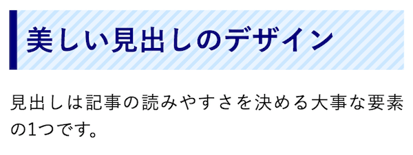
左に縦線が入ったバージョン
コードを表示
CSSh1 {
color: #010079;
text-shadow: 0 0 5px white;
border-left: solid 7px #010079;
background: repeating-linear-gradient(-45deg, #cce7ff, #cce7ff 3px,#e9f4ff 3px, #e9f4ff 7px);
}
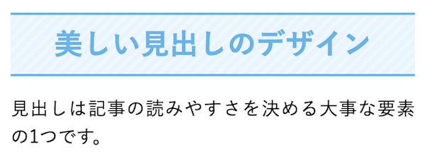
ストライプ+上下線
コードを表示
CSSh1 {
color: #6cb4e4;
text-align: center;
padding: 0.25em;
border-top: solid 2px #6cb4e4;
border-bottom: solid 2px #6cb4e4;
background: repeating-linear-gradient(-45deg, #f0f8ff, #f0f8ff 3px,#e9f4ff 3px, #e9f4ff 7px);
}
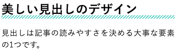
ストライプの下線
コードを表示
CSSh1 {
position: relative;
}
h1::after {
content: "";
position: absolute;
left: 0;
bottom: 0;
width: 100%;
height: 7px;
background: repeating-linear-gradient(-45deg, #6ad1c8, #6ad1c8 2px, #fff 2px, #fff 4px);
}
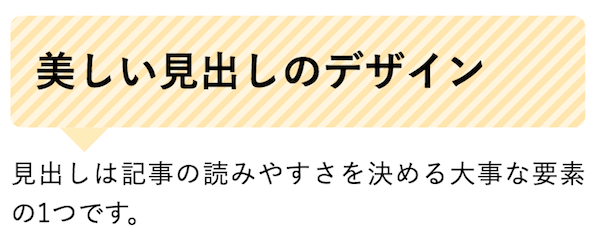
ストライプの吹き出し
コードを表示
CSSh1 {
position: relative;
padding: 0.6em;
background: repeating-linear-gradient(-45deg, #fff5df, #fff5df 4px,#ffe4b1 3px, #ffe4b1 8px);
border-radius: 7px;
}
h1::after {
position: absolute;
content: '';
top: 100%;
left: 30px;
border: 15px solid transparent;
border-top: 15px solid #ffebbe;
width: 0;
height: 0;
}
両端に線を伸ばす
コードを表示
CSSh1 {
position: relative;
display: inline-block;
padding: 0 55px;
}
h1::before, h1::after {
content: '';
position: absolute;
top: 50%;
display: inline-block;
width: 45px;
height: 1px;
background-color: black;
}
h1::before {
left:0;
}
h1::after {
right: 0;
}
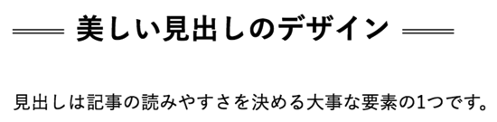
二重線バージョン
コードを表示
CSSh1 {
position: relative;
display: inline-block;
padding: 0 55px;
}
h1::before, h1::after {
content: '';
position: absolute;
top: 50%;
display: inline-block;
width: 45px;
height: 2px;
border-top: solid 1px black;
border-bottom: solid 1px black;
}
h1::before {
left:0;
}
h1::after {
right: 0;
}
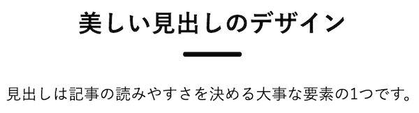
下側に小さく線をつける
コードを表示
CSSh1 {
position: relative;
display: inline-block;
margin-bottom: 1em;
}
h1::before {
content: '';
position: absolute;
bottom: -15px;
display: inline-block;
width: 60px;
height: 5px;
left: 50%;
transform: translateX(-50%);
background-color: black;
border-radius: 2px;
}
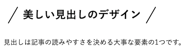
スラッシュで囲む
コードを表示
CSSh1 {
position: relative;
display: inline-block;
padding: 0 45px;
}
h1::before, h1::after {
content: '';
position: absolute;
top: 50%;
display: inline-block;
width: 44px;
height: 2px;
background-color: black;
transform: rotate(-60deg);
}
h1::before {
left:0;
}
h1::after {
right: 0;
}
交差線
calc()は長さを計算するCSSの関数です。この例では、見出しの高さに14pxを足して左右の縦線の長さを決めています。
コードを表示
CSSh1 {
position: relative;
padding: 0.25em 1em;
border-top: solid 2px black;
border-bottom: solid 2px black;
}
h1::before, h1::after {
content: '';
position: absolute;
top: -7px;
width: 2px;
height: calc(100% + 14px);
background-color: black;
}
h1::before {
left: 7px;
}
h1::after {
right: 7px;
}
角がくるん
コードを表示
CSSh1 {
position: relative;
padding: 0.25em 1em;
border: solid 2px black;
border-radius: 3px 0 3px 0;
}
h1::before, h1::after {
content: '';
position: absolute;
width:10px;
height: 10px;
border: solid 2px black;
border-radius: 50%;
}
h1::after {
top:-12px;
left:-12px;
}
h1::before {
bottom:-12px;
right:-12px;
}
葉っぱ風
コードを表示
CSSh1 {
position: relative;
color: #158b2b;
font-size: 20px;
padding: 10px 0;
text-align: center;
margin: 1.5em 0;
}
h1::before {
content: "";
position: absolute;
top: -8px;
left: 50%;
width: 150px;
height: 58px;
border-radius: 50%;
border: 5px solid #a6ddb0;
border-left-color: transparent;
border-right-color: transparent;
transform: translateX(-50%);
}
細カギカッコ
コードを表示
CSSh1 {
position: relative;
line-height: 1.4;
padding:0.25em 1em;
display: inline-block;
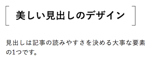
}
h1::before, h1::after {
content:'';
width: 20px;
height: 30px;
position: absolute;
display: inline-block;
}
h1::before {
border-left: solid 1px #ff5722;
border-top: solid 1px #ff5722;
top:0;
left: 0;
}
h1::after {
border-right: solid 1px #ff5722;
border-bottom: solid 1px #ff5722;
bottom:0;
right: 0;
}
大括弧
コードを表示
CSSh1 {
position: relative;
line-height: 1.4;
padding:0.25em 1em;
display: inline-block;
top:0;
}
h1::before, h1::after {
position: absolute;
top: 0;
content:'';
width: 8px;
height: 100%;
display: inline-block;
}
h1::before {
border-left: solid 1px black;
border-top: solid 1px black;
border-bottom: solid 1px black;
left: 0;
}
h1::after {
content: '';
border-top: solid 1px black;
border-right: solid 1px black;
border-bottom: solid 1px black;
right: 0;
}
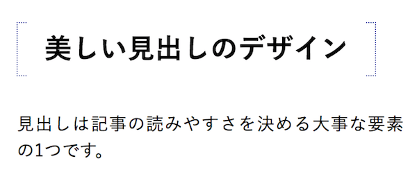
点線バージョン大カッコ
コードを表示
CSSh1 {
position: relative;
line-height: 1.4;
padding:0.25em 1em;
display: inline-block;
top:0;
}
h1::before, h1::after {
position: absolute;
top: 0;
content:'';
width: 8px;
height: 100%;
display: inline-block;
}
h1::before {
border-top: dotted 1px #535aaa;
border-left: dotted 1px #535aaa;
border-bottom: dotted 1px #535aaa;
left: 0;
}
h1::after {
content: '';
border-top: dotted 1px #535aaa;
border-right: dotted 1px #535aaa;
border-bottom: dotted 1px #535aaa;
right: 0;
}
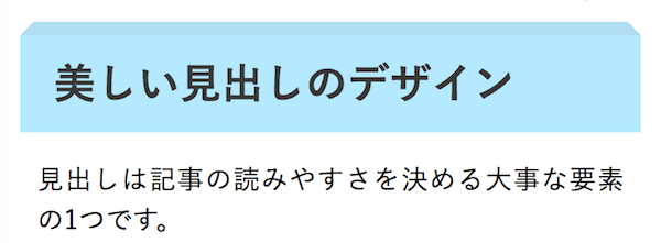
立体的なボックス
コードを表示
CSSh1 {
position: relative;
padding: 0.35em 0.5em;
background: #b6e9ff;
color: #393939;
}
h1::before {
content: " ";
position: absolute;
top: -16px;
left: 0;
width: calc(100% - 16px);
height: 0;
border: solid 8px transparent;
border-bottom-color: #b2ddf0;
}
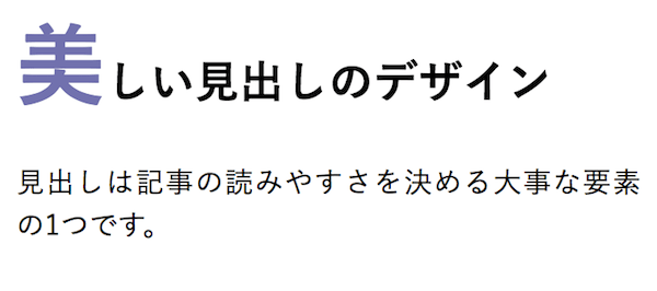
一文字目だけ装飾を変える
コードを表示
CSSh1::first-letter {
font-size: 2em;
color: #7172ac;
}
3. グラデーションを使った見出し
グラデーションをうまく使えば、美しく洗練された印象を与えることができます。
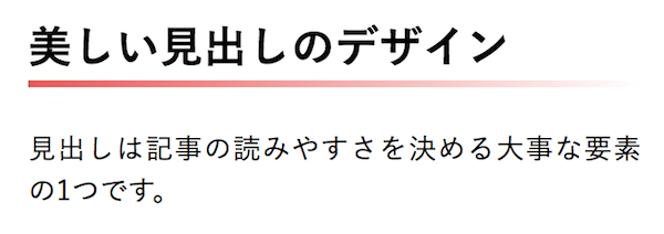
消えていく下線
コードを表示
CSSh1 {
position: relative;
padding: 0.25em 0;
}
h1::after {
content: "";
display: block;
height: 4px;
background: linear-gradient(to right, rgb(230, 90, 90), transparent);
}
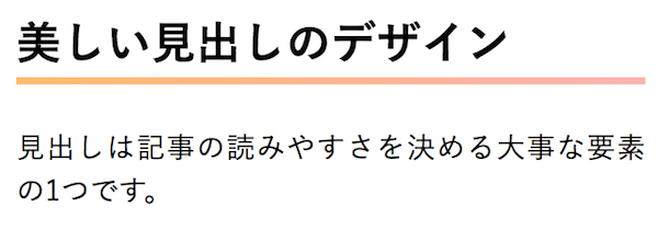
段々と色が変わっていくパターン
コードを表示
CSSh1 {
position: relative;
padding: 0.25em 0;
}
h1::after {
content: "";
display: block;
height: 4px;
background: linear-gradient(to right, rgb(255, 186, 115), #ffb2b2);
}
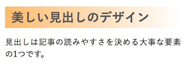
背景をグラデーションで塗る
コードを表示
CSSh1 {
position: relative;
padding: 0.1em 0.5em;
background: linear-gradient(to right, rgb(255, 186, 115), transparent);
color: #545454;
}
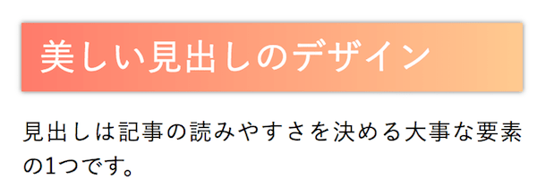
影をつけてみた場合
コードを表示
CSSh1 {
position: relative;
padding: 0.2em 0.5em;
background: linear-gradient(to right, rgb(255, 124, 111), #ffc994);
color: white;
font-weight: lighter;
box-shadow: 0 0 4px rgba(0, 0, 0, 0.56);
}
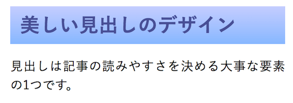
上下のグラデーション
コードを表示
CSSh1 {
position: relative;
padding: 0.3em 0.5em;
background: linear-gradient(to top, rgb(137, 184, 255), #c5ceff);
color: #495193;
}
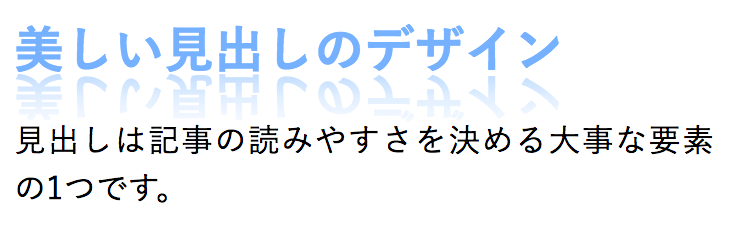
文字の反射
この例だけは標準化されていない-webkit-box-reflectを使います。対応しないブラウザでは反射は表示されませんが、見出しの文字はそのまま読めます。
コードを表示
CSSh1 {
position: relative;
color: #6eb0f9;
line-height: 1.4;
-webkit-box-reflect: below -10px linear-gradient(to bottom, transparent, transparent 10%, rgba(0, 0, 0, 0.6));
}
4. アイコンフォントを使った見出しサンプル
Font Awesomeの公式ガイドで紹介されているように、Web Fontsを使えばCSSの擬似要素にアイコンを表示できます。FontAwesomeの導入方法と基本的な使い方はこちらの記事で解説しています。見出しにアイコンを使う方法にも触れています。
あわせて読みたい【保存版】Font Awesomeの使い方:Webアイコンフォントを使おう
以下のコードはFont Awesome 7のFree/Solid Web Fontsを読み込む前提です。公式のWeb Fonts設定手順に沿って導入したうえで使ってください。記事内の画像は公開当時の表示例です。
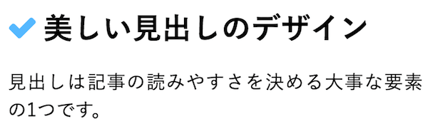
シンプルなチェックマーク
コードを表示
CSSh1 {
position: relative;
padding-left: 1.2em;/*アイコン分のスペース*/
line-height: 1.4;
}
h1::before {
font-family: "Font Awesome 7 Free";
content: "\f00c";/*アイコンのユニコード*/
font-weight: 900;
position: absolute;/*絶対位置*/
font-size: 1em;/*サイズ*/
left: 0;/*アイコンの位置*/
top: 0;/*アイコンの位置*/
color: #5ab9ff; /*アイコン色*/
}
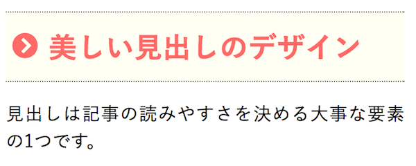
おしゃれなシェブロンマーク
コードを表示
CSSh1 {
position: relative;/*相対位置*/
padding: 0.5em 0.5em 0.5em 1.5em;/*アイコン分のスペース*/
line-height: 1.4;/*行高*/
color: #ff6a6a;/*文字色*/
border-top: dotted 1px gray;
border-bottom: dotted 1px gray;
background: #fffff4;
}
h1::before {
font-family: "Font Awesome 7 Free";/*忘れずに*/
content: "\f138";/*アイコンのユニコード*/
font-weight: 900;
position: absolute;/*絶対位置*/
font-size: 1em;/*サイズ*/
left: 0.25em;/*アイコンの位置*/
top: 0.5em;/*アイコンの位置*/
color: #ff6a6a; /*アイコン色*/
}
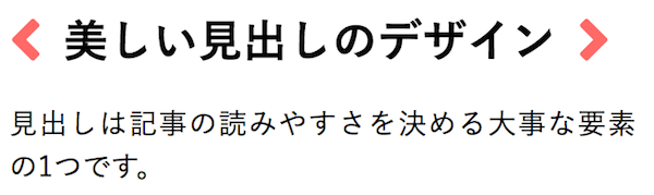
HTMLタグ風
コードを表示
CSSh1 {
position: relative;/*相対位置*/
line-height: 1.4;/*行高*/
display: inline-block;
}
h1::before, h1::after {
position: relative;
font-family: "Font Awesome 7 Free";
font-weight: 900;
display: inline-block;
font-size: 1.0em;
color: #ff6a6a;
}
h1::before {
content:"\f053";/*アイコン種類*/
padding-right: 0.5em
}
h1::after {
content:"\f054";/*アイコン種類*/
padding-left: 0.5em
}
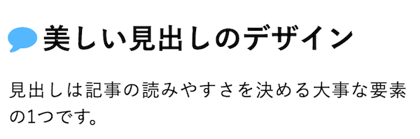
ふきだしアイコン
コードを表示
CSSh1 {
position: relative;/*相対位置*/
padding-left: 1.2em;/*アイコン分のスペース*/
line-height: 1.4;/*行高*/
}
h1::before {
font-family: "Font Awesome 7 Free";
content: "\f075";/*アイコンのユニコード*/
font-weight: 900;
position: absolute;/*絶対位置*/
font-size: 1em;/*サイズ*/
left: 0;/*アイコンの位置*/
top: 0;/*アイコンの位置*/
color: #5ab9ff; /*アイコン色*/
}
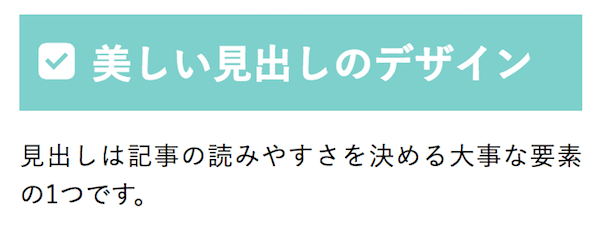
フラットな見出し
コードを表示
CSSh1 {
position: relative;
color: white;
background: #81d0cb;
line-height: 1.4;
padding: 0.5em 0.5em 0.5em 1.8em;
}
h1::before {
font-family: "Font Awesome 7 Free";
content: "\f14a";
font-weight: 900;
position: absolute;
left : 0.5em; /*左端からのアイコンまでの距離*/
}
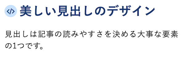
コードアイコンのマーカー
コードを表示
CSSh1 {
position: relative;
padding-left: 30px;
color:#153c6e;
}
h1::before {
position: absolute;
font-family: "Font Awesome 7 Free";
font-weight: 900;
content: "\f121";
background: #c9e2ff;
color: #153c6e;
font-size: 15px;
border-radius: 50%;
left: 0;
width: 25px;
height: 25px;
line-height: 25px;
text-align: center;
top: 50%;
transform: translateY(-50%);
}
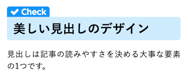
タブ付き
コードを表示
CSSh1 {
position: relative;
color: black;
background: #d0ecff;
line-height: 1.4;
padding: 0.25em 0.5em;
margin: 2em 0 0.5em;
border-radius: 0 5px 5px 5px;
}
h1::after {
/*タブ*/
position: absolute;
font-family: "Font Awesome 7 Free",'Quicksand','Avenir','Arial',sans-serif;
font-weight: 900;
content: '\f00c Check';
background: #2196F3;
color: #fff;
left: 0px;
bottom: 100%;
border-radius: 5px 5px 0 0;
padding: 3px 7px 1px;
font-size: 0.7em;
line-height: 1;
letter-spacing: 0.05em
}
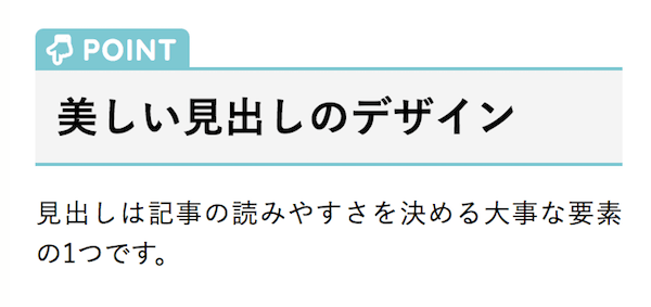
タブ付きその2
コードを表示
CSSh1 {
position: relative;
border-top: solid 2px #80c8d1;
border-bottom: solid 2px #80c8d1;
background: #f4f4f4;
line-height: 1.4;
padding: 0.4em 0.5em;
margin: 2em 0 0.5em;
}
h1::after {
/*タブ*/
position: absolute;
font-family: "Font Awesome 7 Free",'Quicksand','Avenir','Arial',sans-serif;
font-weight: 900;
content: '\f0a7 POINT';
background: #80c8d1;
color: #fff;
left: 0px;
bottom: 100%;
border-radius: 5px 5px 0 0;
padding: 5px 7px 3px;
font-size: 0.7em;
line-height: 1;
letter-spacing: 0.05em;
}
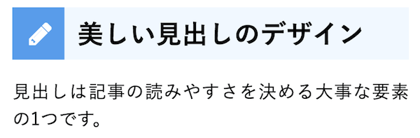
先頭にアイコンをつける例
コードを表示
CSSh1 {
position: relative;
background: #f1f8ff;
padding: 0.25em 0.5em;
border-left: solid 2em #5c9ee7;
}
h1::before {
font-family: "Font Awesome 7 Free";
content: "\f303";
position: absolute;
padding: 0em;
color: white;
font-weight: 900;
left: -1.35em;
top: 50%;
transform: translateY(-50%);
}
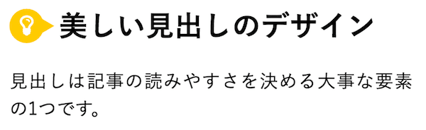
ひらめき
コードを表示
CSSh1 {
position: relative;
padding-left: 35px;
}
h1::before {
position: absolute;
font-family: "Font Awesome 7 Free";
content: "\f0eb";
background: #ffca2c;
color: white;
font-weight: 900;
font-size: 15px;
border-radius: 50%;
left: 0;
width: 25px;
height: 25px;
line-height: 25px;
text-align: center;
top: 50%;
transform: translateY(-50%);
}
h1::after {
/*吹き出しのちょこんと出た部分*/
content: '';
display: block;
position: absolute;
left: 20px;
height: 0;
width: 0;
border-top: 7px solid transparent;
border-bottom: 7px solid transparent;
border-left: 12px solid #ffca2c;
top: 50%;
transform: translateY(-50%);
}
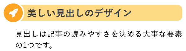
円にアイコンを入れてバーをつける
コードを表示
CSSh1 {
position: relative;
background: #ffd98a;
padding: 2px 5px 2px 25px;
font-size: 20px;
color: #474747;
border-radius: 0 10px 10px 0;
}
h1::before {
font-family: "Font Awesome 7 Free";
content: "\f135";
display: inline-block;
line-height: 40px;
position: absolute;
padding: 0em;
color: white;
background: #ffa337;
font-weight: 900;
width: 40px;
text-align: center;
height: 40px;
line-height: 40px;
left: -1.35em;
top: 50%;
transform: translateY(-50%);
border: solid 3px white;
border-radius: 50%;
}
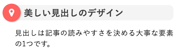
円のまわりに影を付けた場合
コードを表示
CSSh1 {
position: relative;
background: #f4f4f4;
padding: 2px 5px 2px 20px;
font-size: 20px;
color: #474747;
border-radius: 0 10px 10px 0;
}
h1::before {
font-family: "Font Awesome 7 Free";
content: "\f041";
display: inline-block;
line-height: 40px;
position: absolute;
padding: 0em;
color: white;
background: #ff6363;
font-weight: 900;
width: 40px;
text-align: center;
height: 40px;
line-height: 40px;
left: -1.35em;
top: 50%;
transform: translateY(-50%);
border-radius: 50%;
box-shadow: 1px 1px 2px rgba(0, 0, 0, 0.29);
}
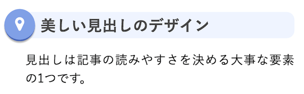
さらに立体的にしてみた場合
コードを表示
CSSh1 {
position: relative;
background: #eff4ff;
padding: 2px 5px 2px 20px;
font-size: 20px;
color: #474747;
border-radius: 0 10px 10px 0;
}
h1::before {
font-family: "Font Awesome 7 Free";
content: "\f041";
display: inline-block;
line-height: 40px;
position: absolute;
padding: 0em;
color: white;
background: #81a1e4;
font-weight: 900;
width: 40px;
text-align: center;
height: 40px;
line-height: 40px;
left: -1.35em;
top: 50%;
transform: translateY(-50%);
border-radius: 50%;
box-shadow: 0px 2px 1px rgba(0, 0, 0, 0.29);
border-bottom: solid 2px #4967b4;
}
点滅するカーソル
コードを表示
CSSh1 {
position: relative;/*相対位置*/
padding-left: 0.8em;/*アイコン分のスペース*/
line-height: 1.4;/*行高*/
}
h1::before {
font-family: "Font Awesome 7 Free";
content: "\f246";/*アイコンのユニコード*/
font-weight: 900;
position: absolute;/*絶対位置*/
font-size: 1em;/*サイズ*/
left: 0;/*アイコンの位置*/
top: 0;/*アイコンの位置*/
color: silver; /*アイコン色*/
animation: blink 1s ease-in-out infinite alternate;
}
@keyframes blink{
0% {opacity:0;}
100% {opacity:1;}
}
@media (prefers-reduced-motion: reduce) {
h1::before {
animation: none;
opacity: 1;
}
}
5. かわいい系
最後にゆるい雰囲気のウェブサイト・ブログに合いそうな見出しデザインサンプルを紹介します。
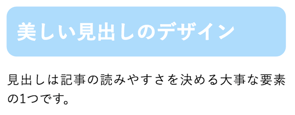
背景色+角丸
コードを表示
CSSh1 {
background: #b0dcfa; /*背景色*/
padding: 0.5em;/*文字周りの余白*/
color: white;/*文字を白に*/
border-radius: 0.5em;/*角の丸み*/
}
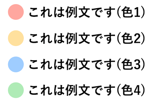
シンプルな円マーク
コードを表示
HTML<h1 class="example1">これは例文です(色1)</h1>
<h1 class="example2">これは例文です(色2)</h1>
<h1 class="example3">これは例文です(色3)</h1>
<h1 class="example4">これは例文です(色4)</h1>
CSSh1 {
position: relative;/*相対位置*/
padding-left: 1.5em;/*アイコン分のスペース*/
line-height: 1.4;/*行高*/
color: black;/*文字色*/
}
h1::before {
font-family: "Font Awesome 7 Free";/*忘れずに*/
content: "\f111";/*アイコンのユニコード*/
font-weight: 900;
position: absolute;/*絶対位置*/
font-size: 1.4em;/*サイズ*/
left: 0;/*アイコンの位置*/
top: -0.2em;/*アイコンの位置*/
}
.example1::before {
color: #ffa7a1;
}
.example2::before {
color: #ffdfa1;
}
.example3::before {
color: #a1ceff;
}
.example4::before {
color: #b1eab8;
}
この例では見出しにクラス名をつけ、それに対してそれぞれ色を指定しています。このようなCSSの書き方についてはこちらの記事で解説しています。
あわせて読みたい初心者向けCSS(スタイルシート)入門:基本的な書き方を総まとめ!
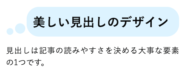
考えごと風
コードを表示
CSSh1 {
position: relative;
padding: 8px 15px;
margin-left: 40px;
background: #def3ff;
border-radius: 20px;
}
h1::before {
font-family: "Font Awesome 7 Free";
content: "\f111";
font-weight: 900;
position: absolute;
font-size: 15px;
left: -40px;
bottom: 0;
color: #def3ff;
}
h1::after {
font-family: "Font Awesome 7 Free";
content: "\f111";
font-weight: 900;
position: absolute;
font-size: 23px;
left: -23px;
bottom: 0;
color: #def3ff;
}
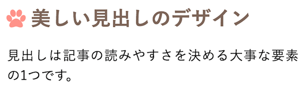
肉球マーカー
コードを表示
CSSh1 {
position: relative;/*相対位置*/
padding-left: 1.2em;/*アイコン分のスペース*/
line-height: 1.4;/*行高*/
color: #7b6459;/*文字色*/
}
h1::before {
font-family: "Font Awesome 7 Free";
content: "\f1b0";/*アイコンのユニコード*/
font-weight: 900;
position: absolute;/*絶対位置*/
font-size: 1em;/*サイズ*/
left: 0;/*アイコンの位置*/
top: 0;/*アイコンの位置*/
color: #ff938b; /*アイコン色*/
}
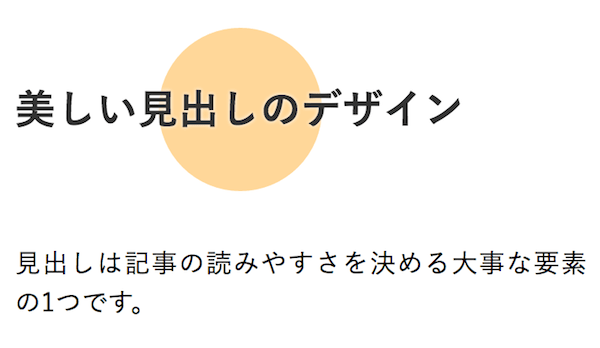
背景にカラフルな円
コードを表示
CSSh1 {
position: relative;
isolation: isolate;
color: #333;
display: inline-block;
margin: 47px 0;
text-shadow: 0 0 2px white;
}
h1::before {
content: "";
position: absolute;
background: #ffd69d;
width: 100px;
height: 100px;
border-radius: 50%;
top: 50%;
left: 50%;
transform: translate(-50%,-50%);
z-index: -1;
}
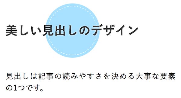
ステッチ模様をつけた場合
コードを表示
CSSh1 {
position: relative;
isolation: isolate;
color: #333;
display: inline-block;
margin: 47px 0;
text-shadow: 0 0 2px white;
}
h1::before {
content: "";
position: absolute;
background: #a9e1ff;
width: 100px;
height: 100px;
border-radius: 50%;
top: 50%;
border: dashed 1px white;
left: 50%;
transform: translate(-50%,-50%);
z-index: -1;
box-shadow: 0px 0px 0px 5px #a9e1ff;
}
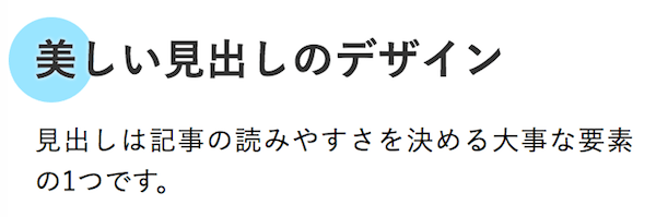
先頭につけた場合
コードを表示
CSSh1 {
position: relative;
isolation: isolate;
color: #333;
text-shadow: 0 0 2px white;
}
h1::before {
content: "";
position: absolute;
background: #9de5ff;
width: 50px;
height: 50px;
border-radius: 50%;
top: 50%;
/* border: dashed 1px white; */
left: -15px;
transform: translateY(-50%);
z-index: -1;
}
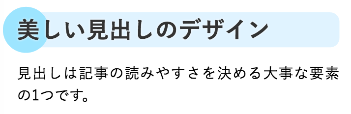
文字の背景を塗った場合
コードを表示
CSSh1 {
position: relative;
color: #333;
text-shadow: 0 0 2px white;
background: #e0f3ff;
isolation: isolate;
z-index: 0;
border-radius: 0 10px 10px;
}
h1::before {
content: "";
position: absolute;
background: #9de5ff;
width: 50px;
height: 50px;
border-radius: 50%;
top: 50%;
left: -15px;
transform: translateY(-50%);
z-index: -1;
}
6. 使用する際のコツ
フォントサイズについて
多くの例ではフォントサイズ(font-size)を指定していません。一部の例に固定値がありますが、実際に使う見出しのレベルや周囲の文章に合わせて調整してください。文字を拡大したときにも読める大きさと余白を確保しましょう。
見出しの使い方
そもそもの見出しタグの書き方や正しい使い方はこちらの記事で解説しています。
あわせて読みたい【HTML】見出しタグの使い方:h1〜h6はどう使い分ける?
カスタマイズの方法はこちらの記事が参考になるはずです。
あわせて読みたい【CSS】文字装飾の基本を総まとめ!初心者向けに解説